The Visual Science of Art Conference 2017
25–27 August 2017 | Berlin, Germany
Organized by Claus-Christian Carbon (U Bamberg) & Joerg Fingerhut (HU Berlin)
25–27 August 2017 | Berlin, Germany
Organized by Claus-Christian Carbon (U Bamberg) & Joerg Fingerhut (HU Berlin)
The Visual Science of Art Conference (VSAC) was established in 2012 by Professor Baingio Pinna in Alghero/Italy. Its main focus is to better connect the communities of visual scientists and artists in order to deepen our understanding of aesthetic phenomena. The VSAC is an ideal venue to debate and collaborate on all topics associated with the perception and evaluation of artworks.
From its beginnings the VSAC has been organized as a satellite conference of the ECVP (European Conference on Visual Perception), the leading European conference on visual science.
VSAC and its sister conference ECVP have been hosted each year in different, vibrant cities all over Europe. Starting in 2012 in Alghero/Italy, subsequent meetings were organized in Belgrade/Serbia (2014), Liverpool/UK (2015) and Barcelona/Spain (2016).
Please, spread the word: download the flyer, share us on Facebook, Twitter, and Linkedin.
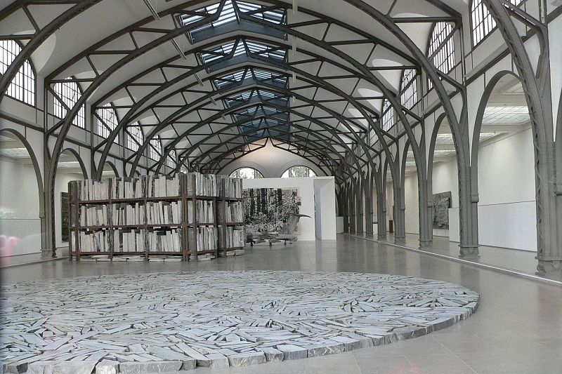
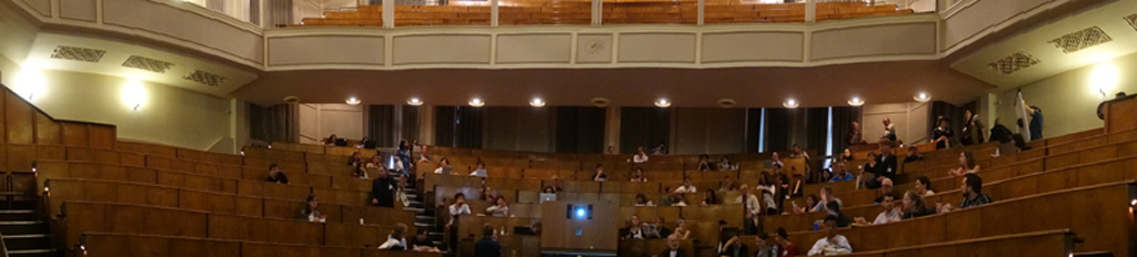
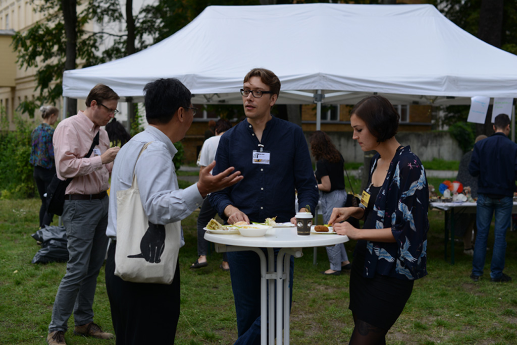
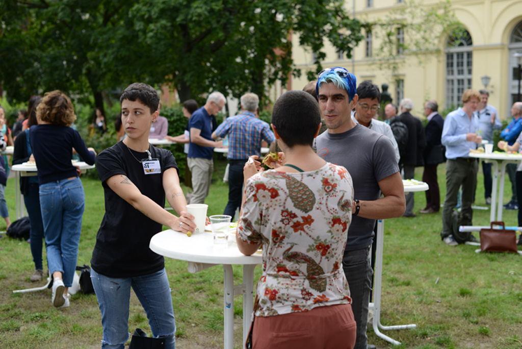
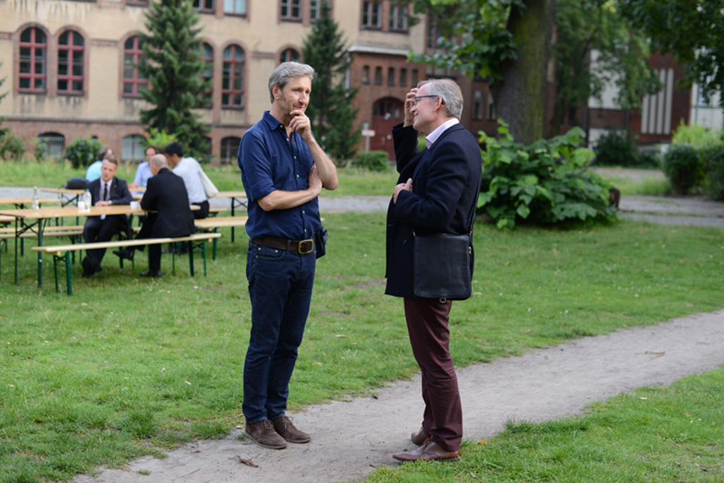
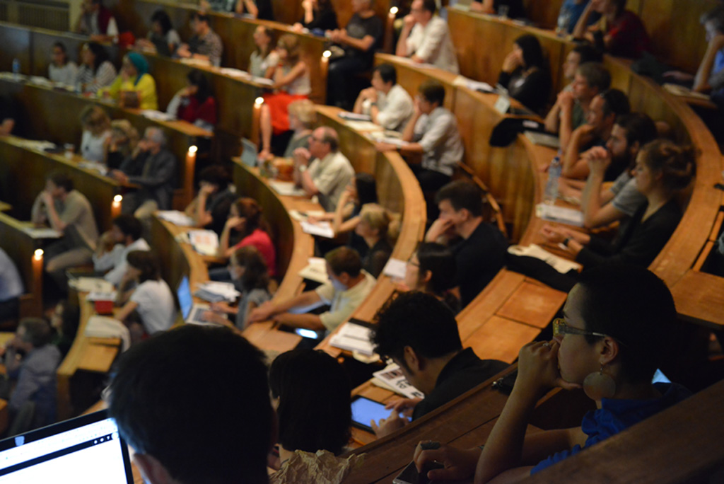
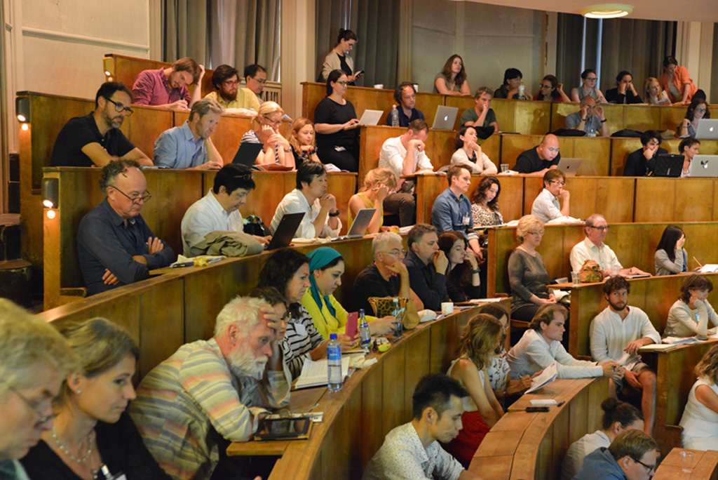
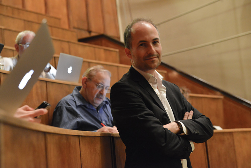
The fifth installment of the VSAC (Visual Science of Art Conference) will be held in Berlin, Germany. Organized again as a satellite conference to the visual planet ECVP (European Conference on Visual Perception), the VSAC invites all people that connect visual perception and the arts (e.g., empirical, experimental, philosophical, phenomenological, computational approaches). Come to the center of Berlin, be part of the VSAC & enjoy three great days together with scientists, artists and with people who are fascinated by aesthetic phenomena.
Yours CCC & Joerg Fingerhut
The abstracts will be published later on in the renowned journal Art & Perception
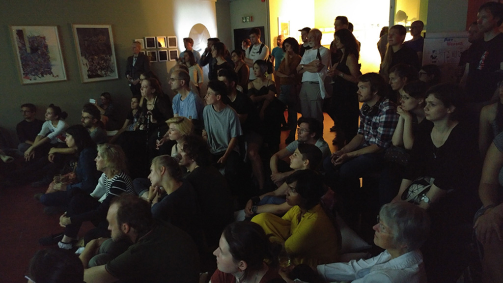
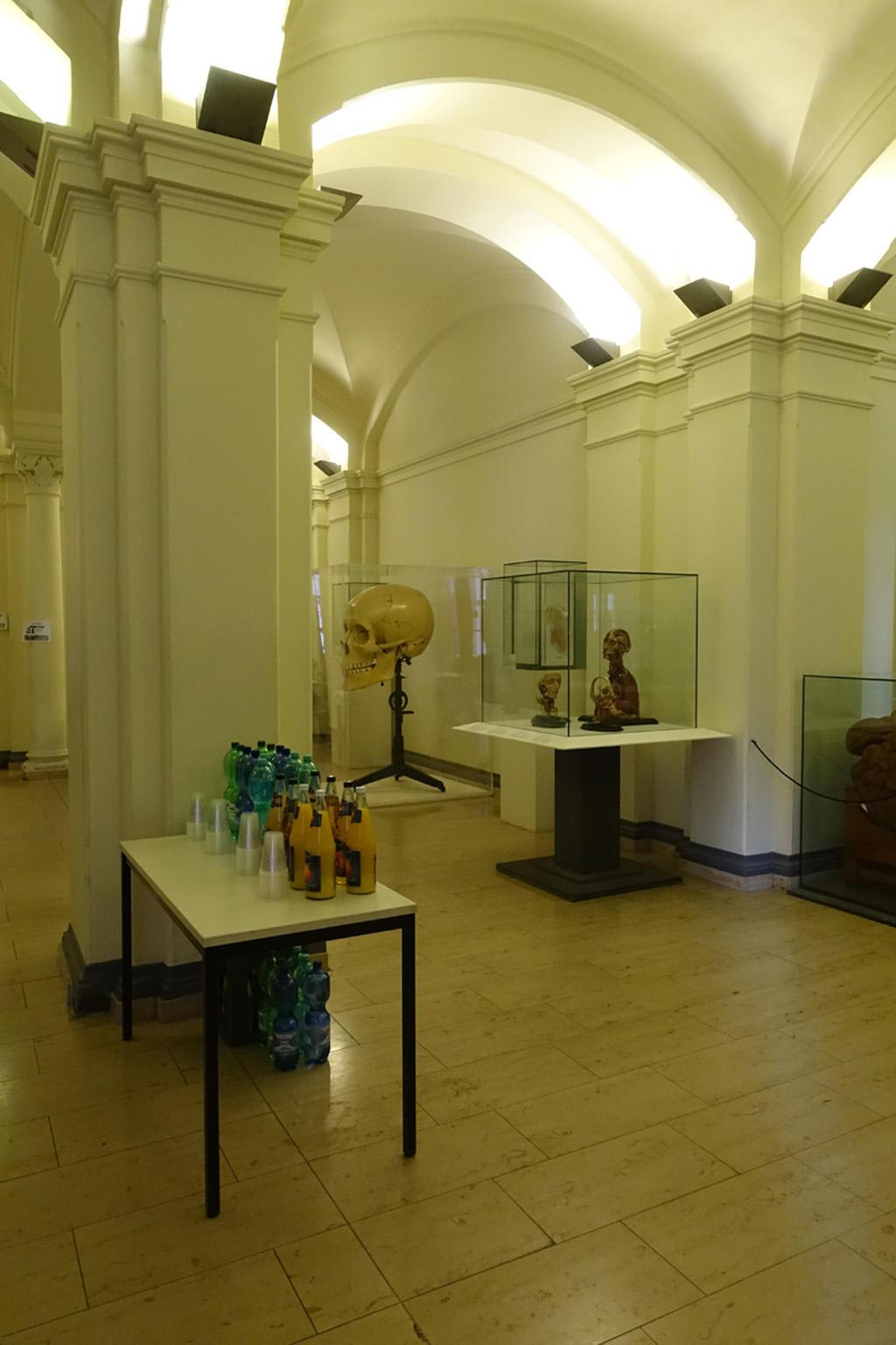
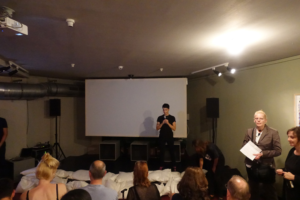
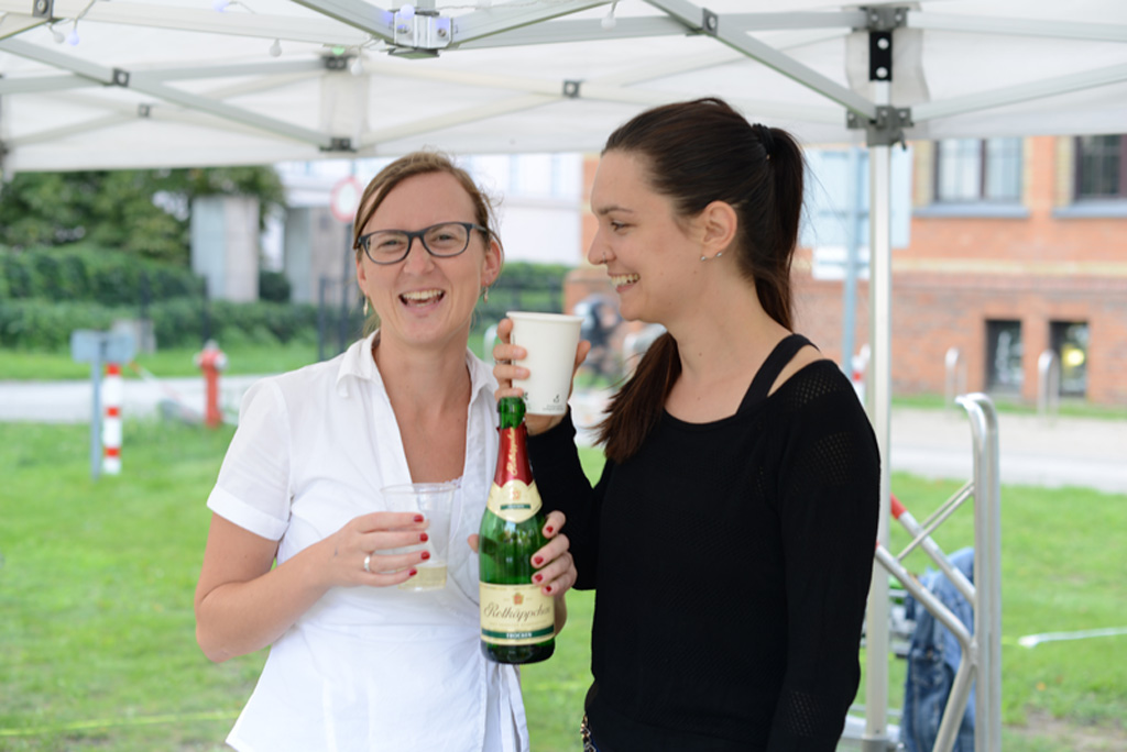
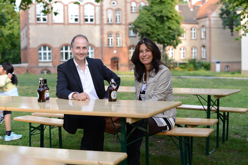
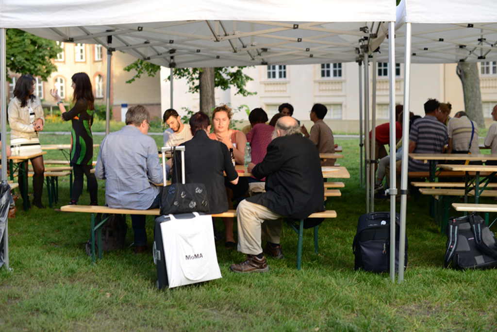
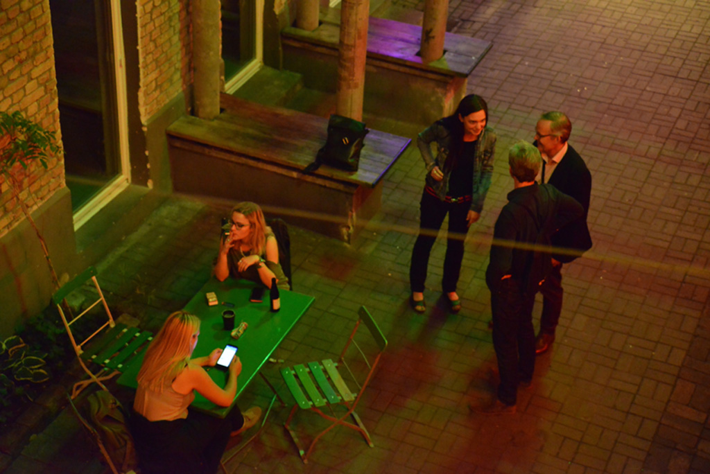
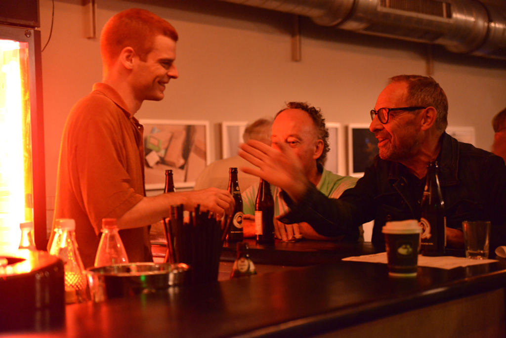
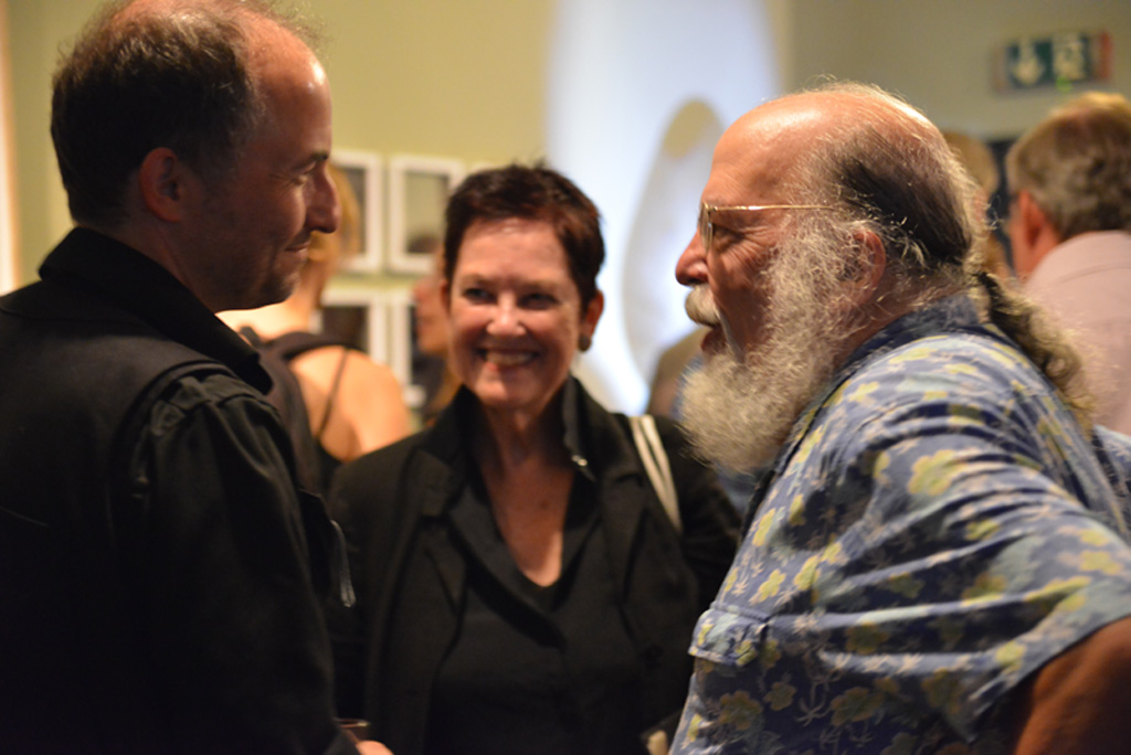
With time to chat, time to eat and drink … and to chill out
| | | |
| | ||
| | ||
| | ||
| | ||
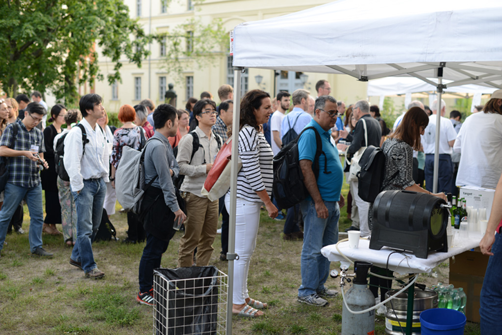
| 12:00 | assignment_ind | Registration |
| | ||
| 13:15 | Opening remarks | |
| 13:20 | desktop_windows |
Talk session #1 Seeing as image thinkingchair: Johan Wagemans Session comic |
| | ||
| 14:30 | local_cafe | Coffee |
| 15:00 | desktop_windows |
Talk session #2 How universal are aesthetics?chair: Andrea van Doorn & Jan Koenderink Session comic |
| | ||
| | ||
| 16:30 | local_cafe | Coffee |
| 17:00 | star |
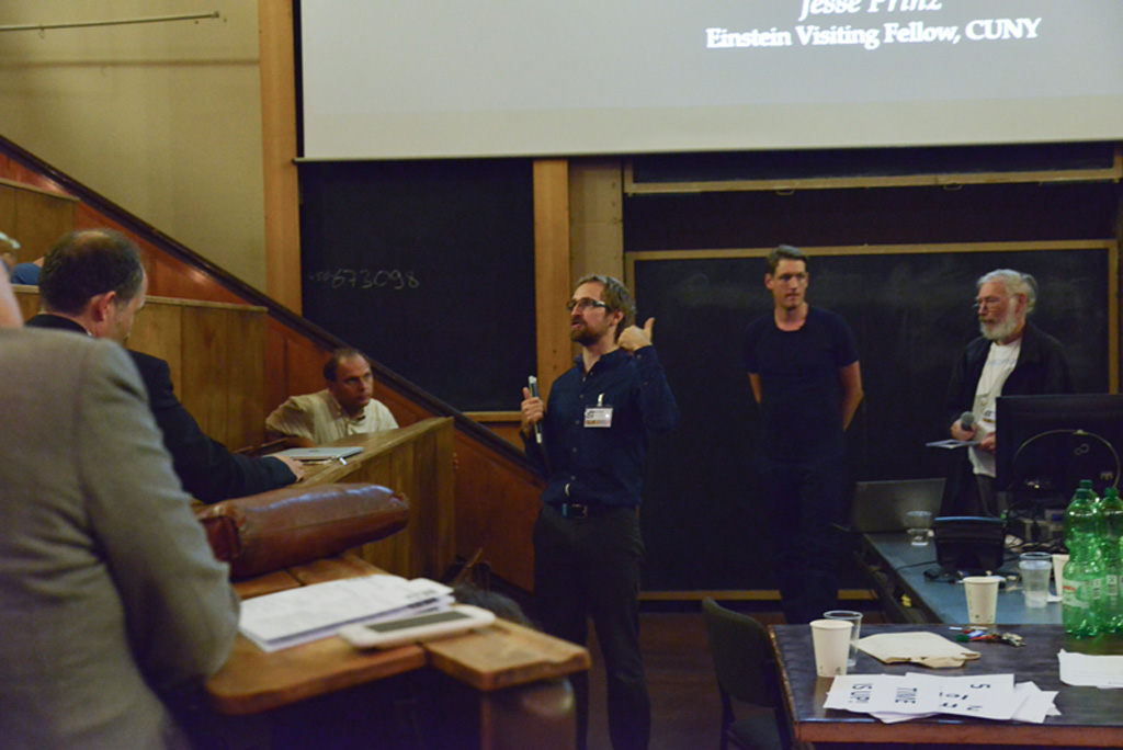
Keynote "Art and Wonder" by Jesse Prinz
Keynote comic |
| | ||
| | ||
| 18:30 | local_cafe | Dinner |
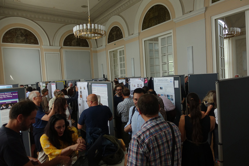
| 19:00 | library_books |
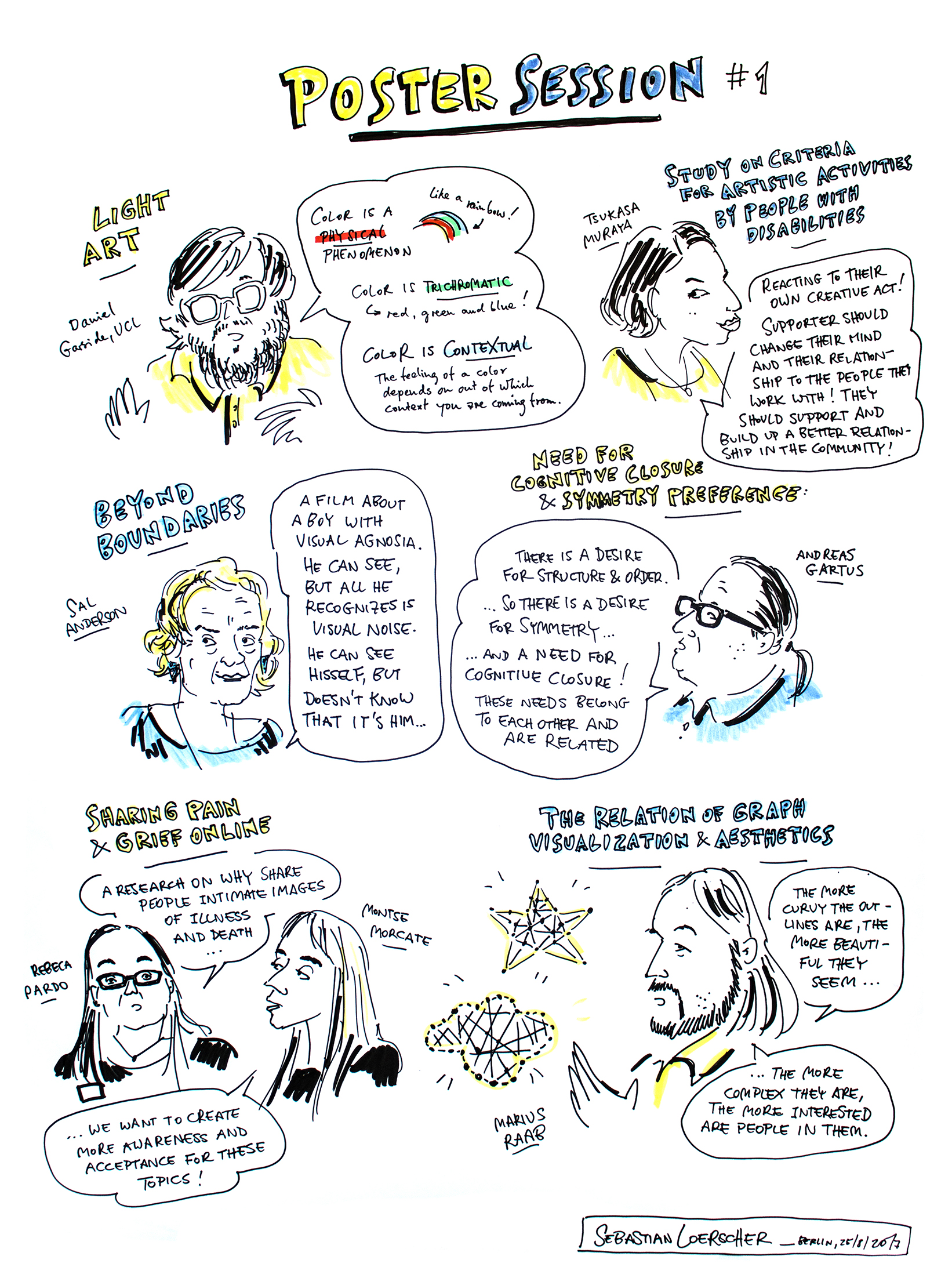
Poster session #1 Session comic |
| | ||
| | ||
| 20:30 |
| 9:30 | desktop_windows |
Talk session #3 Space of the mind's eyechair: Nicholas Wade |
| | ||
| | ||
| 11:00 | local_cafe | Coffee |
| 11:30 | desktop_windows |
Talk session #4 Physiology & artchair: Nicola Bruno |
| | ||
| | ||
| 13:00 | local_cafe | Smart lunch and coffee |
| 13:30 | library_books |
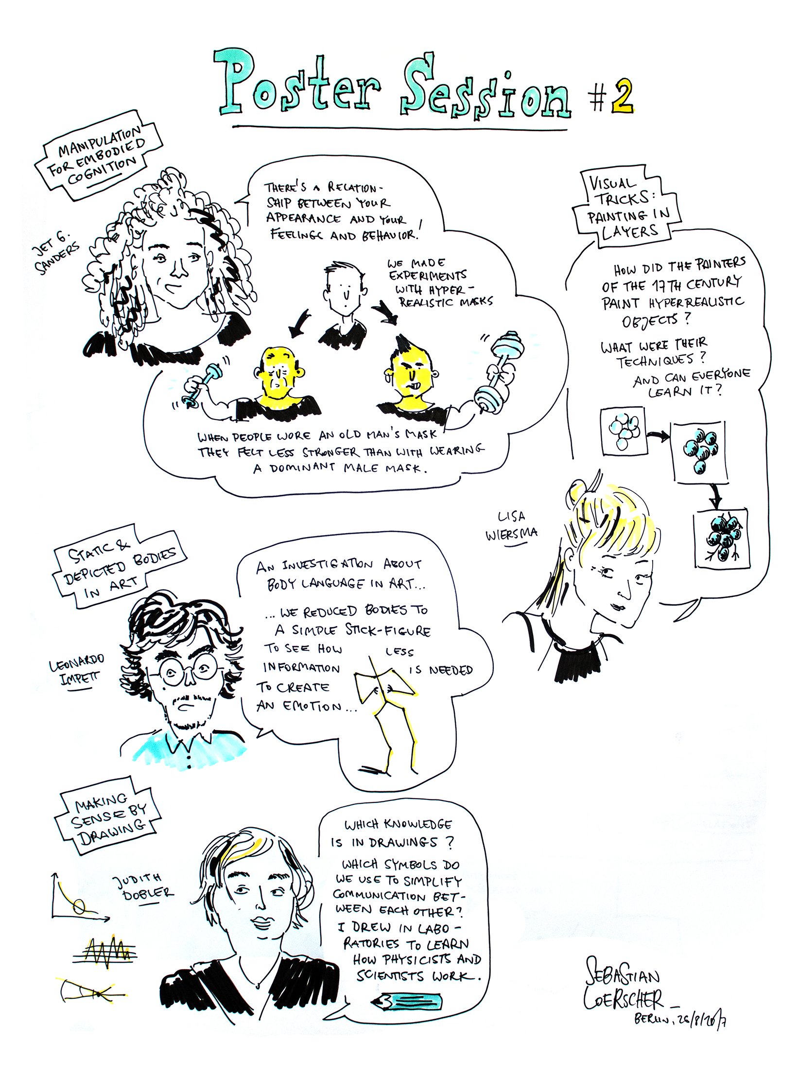
Poster session #2 Session comic |
| | ||
| | ||
| 15:00 | desktop_windows |
Talk session #5 Mixed sessionchair: Robert Pepperell Session comic |
| | ||
| | ||
| | ||
| 17:00 | local_cafe | Coffee |
| 17:30 | star |
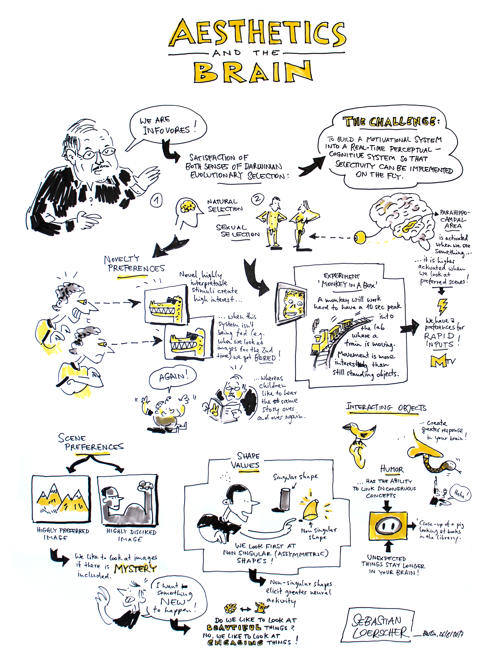
Keynote "Aesthetics and the Brain" by Irving Biedermann Keynote comic |
| | ||
| 19:00 | ||
| | | |
| | | |
| 20:30 | color_lens | VSAC Art Night at ACUD |
| 0:00 |
| 9:45 | local_cafe | Coffee |
| 10:00 | Business Meeting | |
| 10:30 | desktop_windows |
Talk session #6 Principal propertieschair: Marco Bertamini |
| | ||
| | ||
| 12:00 | Closing remarks |

Einstein Visiting Fellow, Berlin School of Mind and Brain, Humboldt-Universität zu Berlin, City University of New York, Graduate Center, New York
Jesse Prinz is the Einstein Visiting Fellow 2015-2017 at the Berlin School of Mind and Brain and Distinguished Professor of Philosophy at the Graduate Center of the City University of New York (CUNY). Prinz is interested in how philosophical accounts of the mental can be informed by findings from psychology, the neurosciences, anthropology, and related fields. His research interests include emotion, consciousness, cultural cognition, concepts, perception, moral psychology, and aesthetics. His book on art and aesthetics, Works of Wonder, is forthcoming 2017. Much of his work is a continuation of the classical empiricist tradition, which emphasizes the role of perceptual experience and socialization in grounding our cognitive capacities. For more information consult his personal website.
It is often presumed that the appreciation of art involves emotion, but there has been little effort to identify what emotion could play this role. Traditionally, good art was said to induce pleasure, but that seems unlikely in cases where we appreciate art with dark themes. Other authors have posited an “aesthetic emotion” but that proposal is evades the question rather than answering it. Here an alternative is suggested: the cardinal emotion underling art appreciation is wonder. Both empirical and theoretical work are brought to bear in defense of this hypothesis. Wonder is also shown to provide promising accounts of aesthetic experience, beauty, and the nature of art.

Harold W. Dornsife Professor of Neuroscience, Director of Image Understanding Laboratory, Departments of Psychology, Computer Science, and the Neuroscience Program, University of Southern California
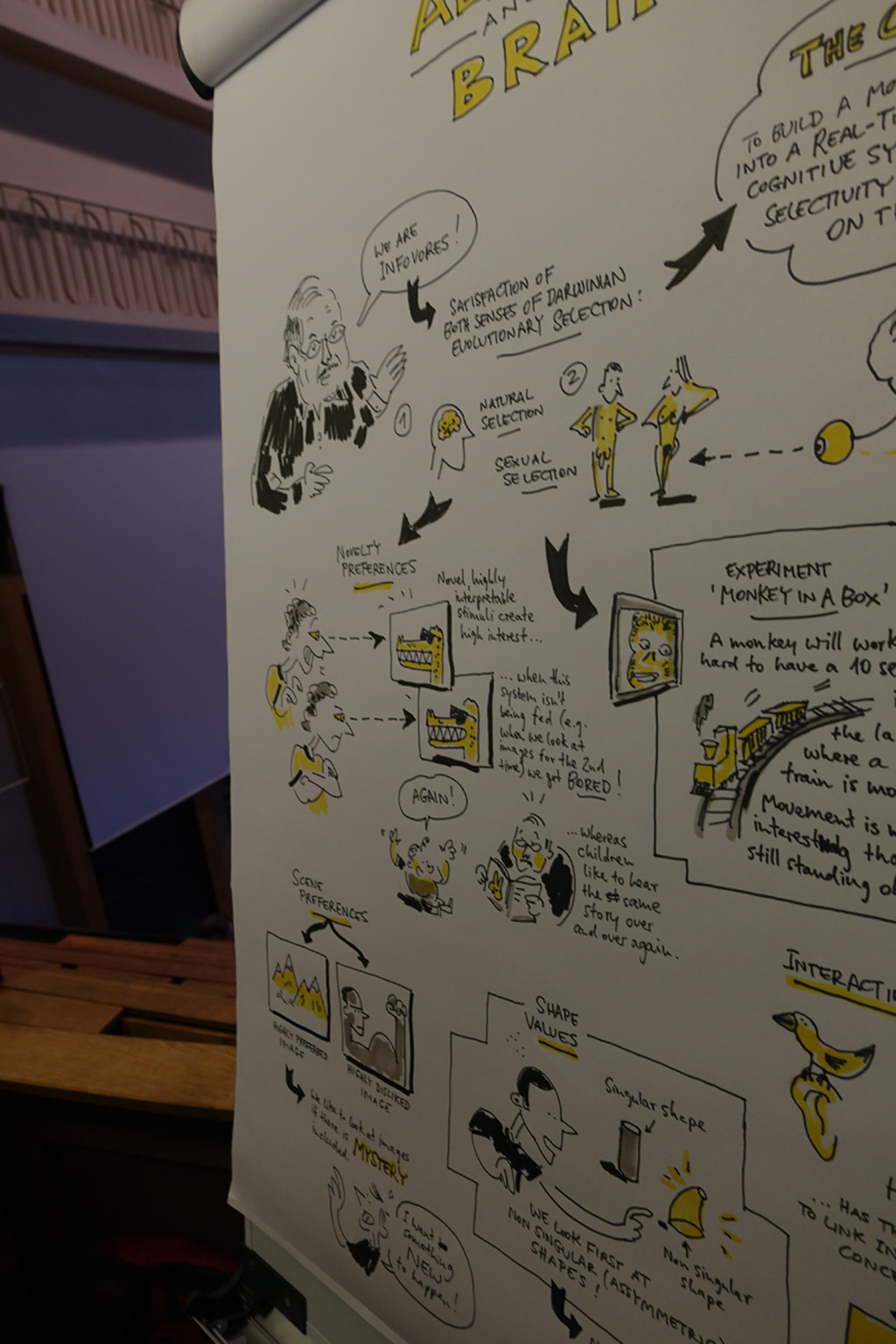
"Beauty is in the eye of the beholder,” goes the old cliché. Poetic, to be sure, but hardly exacting enough for neuroscientists. Irving Biederman might rephrase it: "The pleasure of a rich, novel perceptual or cognitive experience derives from the opioid activity of the cerebral cortex." It is what makes us infovores, always seeking new, but interpretable experiences. Biederman focuses on the brain's role in vision, investigating the brain processes underlying humans' ability to quickly recognize and interpret what they see. Biederman's new theory might go a long way toward explaining how we cast our attention on our surroundings and why we find one thing more interesting at first blush than another. His research includes shape, object, and scene perception/recognition by human beings and face recognition.
Why would an aesthetic sense ever have evolved? How might it be implemented in the brain? The surprising discovery of a gradient of opioid receptors in cortical areas engaged in perception and cognition may provide the key for understanding our pleasure at viewing an engaging work of art, an extraordinary vista, understanding a scientific theory (or any good idea), or the mirth engendered by a joke. If we assume that experiences are preferred that maximize this opioid activity, then preferred inputs will tend to be those that are richly interpretable (not just complex). Once we have an experience, however, adaptation reduces the activity, diminishing the release of opioids, leading to novelty preferences (or “been there, done that”). This system thus renders us infovores, serving to maximize the rate at which we acquire new but interpretable information.
Department of General Psychology and Methodology
University of Bamberg
Markusplatz 3, D-96047 Bamberg, Germany
Einstein Group Jesse Prinz “Consciousness, Emotions, Values”
Humboldt-Universität zu Berlin
Berlin School of Mind and Brain
Unter den Linden 6, D-10099 Berlin, Germany
HVEI is a conference, and a community, dedicated to research at the intersection of human vision/cognition, imaging technologies and aesthetics/art. The conference runs for four days, with peer-reviewed technical presentations and posters punctuated with interactive discussions, panels, short courses, and social activities. Every year, special invited sessions introduce new topics to the HVEI community, broadening the dialogue and encouraging new areas of research.
HVEI's goal is to enable communication and collaboration across disciplines. HVEI authors and attendees come from academic departments in computer science, imaging science, engineering, psychology, cognitive neuroscience and art; they also come from high tech and government laboratories, and from art studios and start-ups.
The Proceedings are published online and are free-access, with no charges to the authors or the readers.
Conference Topics:
All accepted papers are published in the proceedings of Electronic Imaging. Authors must submit a 4-6-page paper with optional figures using the symposium template. Authors can optionally select JIST-First submission option for expedited review and publication in the Journal of Imaging Science and Technology (JIST) before the conference, oral presentation at the conference, and inclusion in the conference proceedings (earlier submission deadline requirement).
Important Dates:
JIST-First submission deadline: 30 June 2018 (4-6-page paper) Regular
Submission deadline: 15 August 2018 Author notification: September-October
2018 Conference dates: 28 January - 1 February 2018
Conference Chairs:
The background drawing is from Albrecht Dürer's "The Painter's Manual", published in 1525. The image nicely illustrates the scientific technique of accurately depicting perspective, so can be seen as a good example of the joint and powerful forces of art & science illustrating one of the VSAC's main aims: to bring together artists and scientists - and artists who follow a scientific path in their arts.
Haftungsbeschränkung für eigene Inhalte Alle Inhalte unseres Internetauftritts wurden mit Sorgfalt und nach bestem Gewissen erstellt. Eine Gewähr für die Aktualität, Vollständigkeit und Richtigkeit sämtlicher Seiten kann jedoch nicht übernommen werden. Gemäß § 7 Abs. 1 TMG sind wir als Dienstanbieter für eigene Inhalte auf diesen Seiten nach den allgemeinen Gesetzen verantwortlich, nach den §§ 8 bis 10 TMG jedoch nicht verpflichtet, die übermittelten oder gespeicherten fremden Informationen zu überwachen. Eine umgehende Entfernung dieser Inhalte erfolgt ab dem Zeitpunkt der Kenntnis einer konkreten Rechtsverletzung und wir haften nicht vor dem Zeitpunkt der Kenntniserlangung.
Haftungsbeschränkung für externe Links Unsere Webseite enthält sog. „externe Links“ (Verknüpfungen zu Webseiten Dritter), auf deren Inhalt wir keinen Einfluss haben und für den wir aus diesem Grund keine Gewähr übernehmen. Für die Inhalte und Richtigkeit der Informationen ist der jeweilige Informationsanbieter der verlinkten Webseite verantwortlich. Als die Verlinkung vorgenommen wurde, waren für uns keine Rechtsverstöße erkennbar. Sollte uns eine Rechtsverletzung bekannt werden, wird der jeweilige Link umgehend von uns entfernt.
Urheberrecht Die auf dieser Webseite veröffentlichten Inhalte und Werke unterliegen dem deutschen Urheberrecht. Jede Art der Vervielfältigung, Bearbeitung, Verbreitung und jede Art der Verwertung außerhalb der Grenzen des Urheberrechts bedarf der vorherigen schriftlichen Zustimmung des jeweiligen Urhebers bzw. Autors.
Datenschutz Durch den Besuch unseres Internetauftritts können Informationen über den Zugriff (Datum, Uhrzeit, aufgerufene Seite) auf dem Server gespeichert werden. Dies stellt keine Auswertung personenbezogener Daten (z.B. Name, Anschrift oder E-Mail Adresse) dar. Sofern personenbezogene Daten erhoben werden, erfolgt dies – sofern möglich – nur mit dem vorherigen Einverständnis des Nutzers der Webseite. Eine Weiterleitung der Daten an Dritte findet ohne ausdrückliche Zustimmung des Nutzers nicht statt. Wir weisen ausdrücklich darauf hin, dass die Übertragung von Daten im Internet (z.B. per E-Mail) Sicherheitslücken aufweisen kann. Ein lückenloser Schutz der Daten vor dem Zugriff Dritter kann nicht gewährleistet werden. Wir können keine Haftung für die durch solche Sicherheitslücken entstehenden Schäden übernehmen. Der Verwendung veröffentlichter Kontaktdaten durch Dritte zum Zwecke von Werbung wird ausdrücklich widersprochen. Wir behalten uns rechtliche Schritte für den Fall der unverlangten Zusendung von Werbeinformationen, z.B. durch Spam-Mails, vor.
Photos of museums were obtain from Wikimedia Commons under are in public domain or are used under Creative Commons license. Photo of the Reichsbahnbunker: own work of user Nicor. Photo of East Side Gallery (“The Wall”): own work user Jaimrsilva. Photo of Hamburger Bahnhof: own work of user JuergenG.
©Sebastian Loerscher
©Sebastian Loerscher

©Sebastian Loerscher
©Sebastian Loerscher
©Sebastian Loerscher

©Sebastian Loerscher
©Sebastian Loerscher
| Authors | Title |
|---|---|
| Tom Lambeens and Sofie Gielis | The silence of the image and the symbolusion |
| Griet Moors | Seeing without knowing in the 2.5-dimensional |
| Authors | Title |
|---|---|
| Branka Spehar and Richard Taylor | What is universal in aesthetic preference? |
| Edward Vessel, Ilkay Isik, Amy Belfi, Jonathan Stahl and Gabrielle Starr | Aesthetic appreciation of cultural artifacts engages additional processes beyond a core domain-general system |
| Joerg Fingerhut, Aenne A. Brielmann, Antónia Reindl and Jesse Prinz | Cultural differences in the aesthetic appeal of complexity in art |
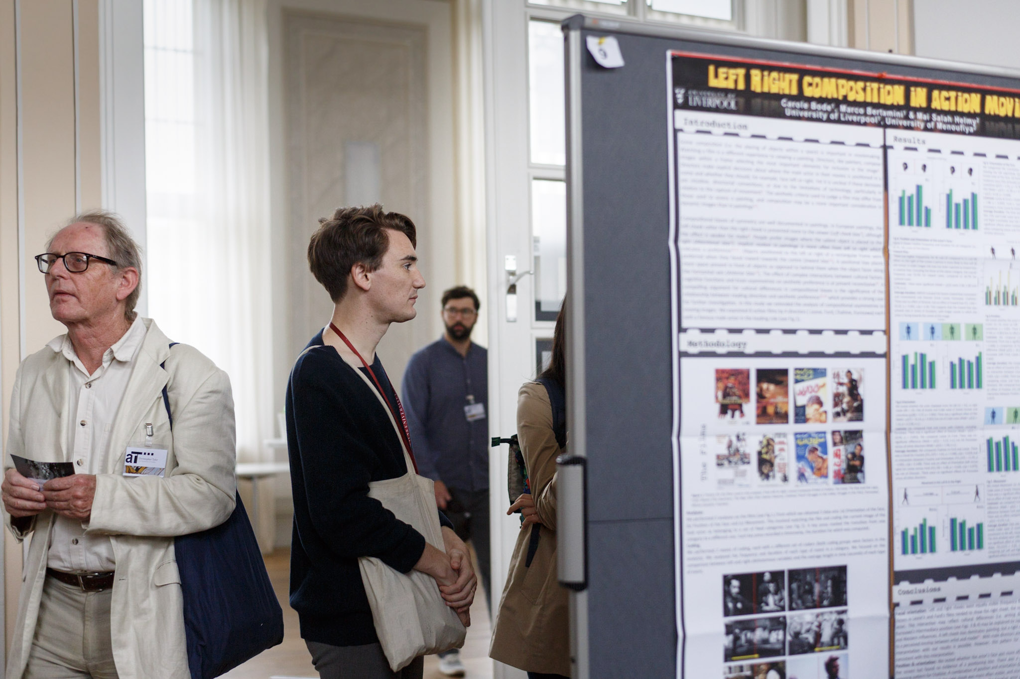
| Marco Bertamini, Carole Bode and Mai Salah Helmy | Symmetry preferences in Britain and Egypt |
| Authors | Title |
|---|---|
| Jan Koenderink and Andrea van Doorn | Topology of space in the picture frame |
| Robert Pepperell and Nicole Ruta | Image and imagination: how figure scale in medieval painting reflects visual perception |
| Margit Lukacs and Persijn Broersen | Framing the Virtual - Creating Space with Time |
| Maarten Wijntjes | Synoptic pictorial space |
| Authors | Title |
|---|---|
| Johannes M Zanker, Jasmina Stevanov, Jade Jackson and Tim Holmess | Mobile eye tracking to explore interaction with abstract paintings – A large scale experiment in the Royal Academy |
| Joanna Ganczarek and Karolina Pietras | Where To Fixate (WTF): oculomotor strategies in perception of contemporary paintings. |
| Letizia Palumbo, Neil Harrison and Marco Bertamini | Preference and approach response for smooth curvature: an ERP study. |
| Łukasz Kędziora | The usefulness of mobile EEG equipment in analysis and documentation of performance art. |
| Authors | Title |
|---|---|
| Denis Pelli and Aenne Brielmann | Beauty requires thought |
| Claus-Christian Carbon | True art experience: What we can learn from ecological contexts, settings, and material |
| Christopher Tyler | Auto-ritratto: Self-portraiture, dyadic consciousness and the auto-regressive eigenfunction - beyond Gödel, Escher and Bach. |
| Nathalie Vissers, Valeria Guiot, Sarah Delcourt, Dominique Genin and Johan Wagemans | On the edge of attractive chaos in a series of semi-abstract photographs by Dominique Genin |
| Philip Letsch and Gregor Uwe Hayn-Leichsenring | Composing Abstract Images – Differences between Artists and Lay People |
| Authors | Title |
|---|---|
| Christoph Redies and Anselm Brachmann | Differences in statistical image properties between traditional art, Bad Art and abstract art |
| George Mather | Visual statistics of large samples of Western artworks |
| Manuela Marin and Helmut Leder | Exploring aesthetic experiences of females: Affect-related traits predict complexity and arousal responses to music and affective pictures |
| Claudia Muth, Claus-Christian Carbon and Gesche Westphal-Fitch | Experiencing (dis)order: simplicity and order might be appealing but interesting patterns are those that diverge from an obvious order |
... featuring: Charlotte Broecker, Persijn Broersen & Margit Lukács, Liat Grayver, Kerem Halman, Gina Eickers, Shelley James, Maarten de Kroon, Robert Pepperell, Morgan O’Hara, Miao Xiaochun,... and more exciting art-science interactions!
Curated by Gina Eickers
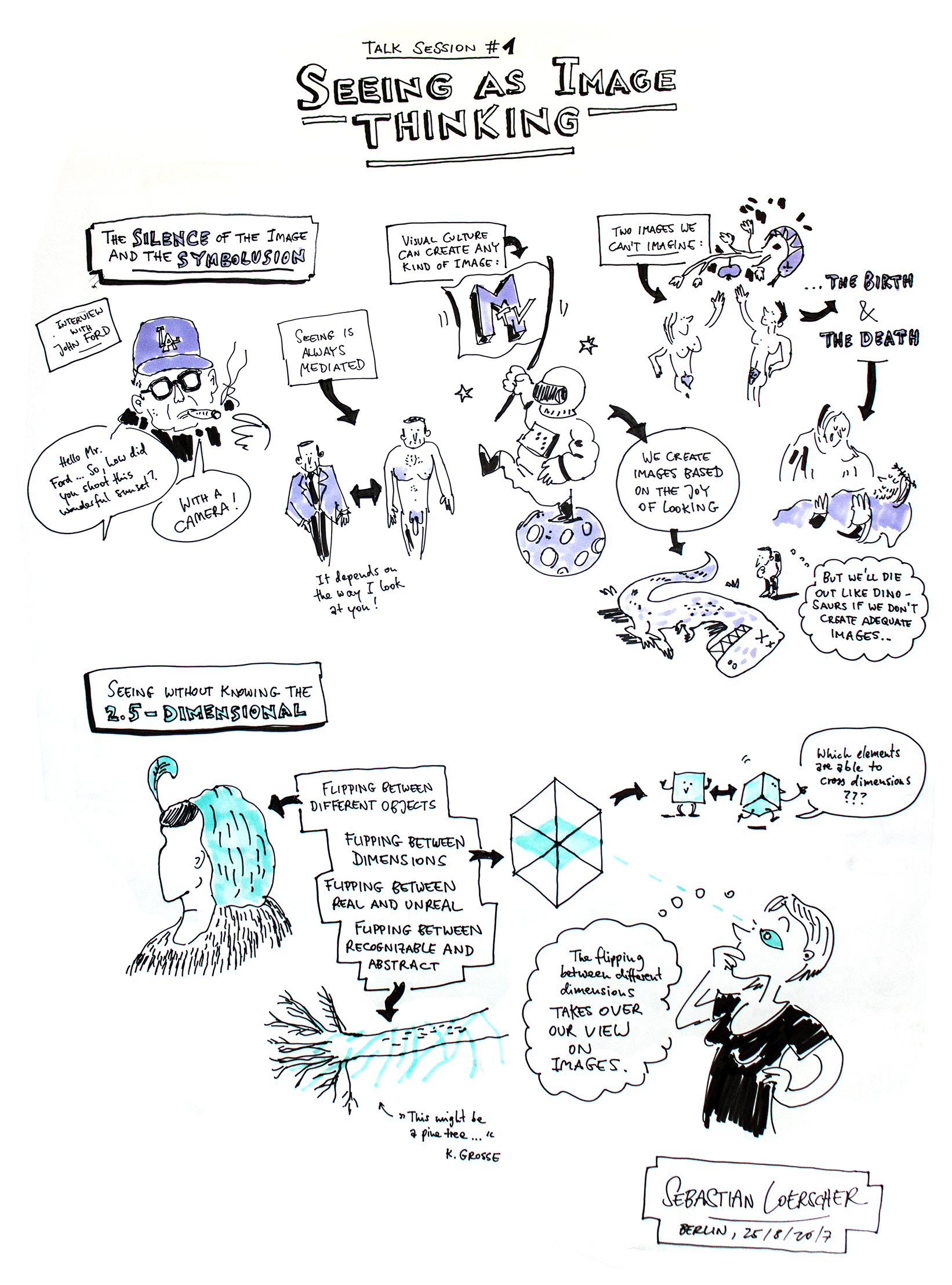
The contemplation of images and metaphors can be considered through imagery itself. We would like to introduce two tuned concepts that will function as building blocks in the theoretical groundwork of the artistic-academic image thinking: the silence of the image and the symbolusion. The first weighs the nature of the image, with its signifying richness and the resistance to arrive at speaking or writing from that silence. We read images as fields of meaning that offer a dynamic structure of formal details and material appearance that can be interpreted. Both the structure present in the image, and the inseparable interpretation that can be derived from that, are metaphorical in nature. Only metaphors and metonymies can lure the silence of the image into talkative imagery – the speech of the image. This implies that each speech of an image is preceded by an implicit comprehensive silence of the image, just like every explicit message contains an implicit charge. Thus, metaphors are anything but an ornament. Their unpredictable nature affects the essence of the image. The expression of the metaphor indicates that a choice has been made from the barely reducible vast potential of the silence of the image.
With the increase of online, open-access museum collections, new opportunities arise for the fields of digital art history and visual perception. High resolution images of artworks are available, together with metadata about the artist, medium, dimensions, provenance, etc. In our project, we use these collections to investigate how painters depict material properties. The currently available metadata in these collections does not contain information about which objects or materials are depicted: we have to use human annotations to gain this information. Here, we present the results of an exploratory study on annotation of depicted materials in paintings. We investigated what kind of class labels humans use to describe the depicted materials, and whether a free naming task or a forced choice strategy works best. Using these novel metadata, we can analyze art historical questions such as differences between time periods, artists or genres. Furthermore, the data may reveal insights into the quality of depiction: low agreement in annotations could indicate ambiguity in material depictions. Additionally, segmented material data can be used for a variety of vision science experiments. Preliminary results indicate that observers are capable of performing annotation tasks, but also show that this task is non-trivial. Observers occasionally confuse objects with materials and show a large variability in their attention to detail.
Our ‘knowing’ about ‘seeing’ is like watching the optical illusion of the old and the young woman. The knowing look alternates, you never see both women at once. For the not-knowing look, such an image is totally uninteresting because it has the ability to note several slips between realities at a time. A separate interpretation of the one or the other reality is impossible. We move into a zone in which it is nor this nor that, but in which meaning arises in their complex coherence. Where for the knowing look the oscillation between the young and elderly woman needs a split second in order to make the recognition possible, this instant of time evaporates into nonexistence in the not-knowing look. The young woman ís the old woman and vice versa, and the lifetime between them is captured in the image. This view is translated into seeing between the flat and the spatial. Something is not flat or spatial, but both at once. Essential is the mental movement you make while looking. This is not subordinate to origin or end point. It's about the way in which one is moved throughout the image, and how the image forces this motion.
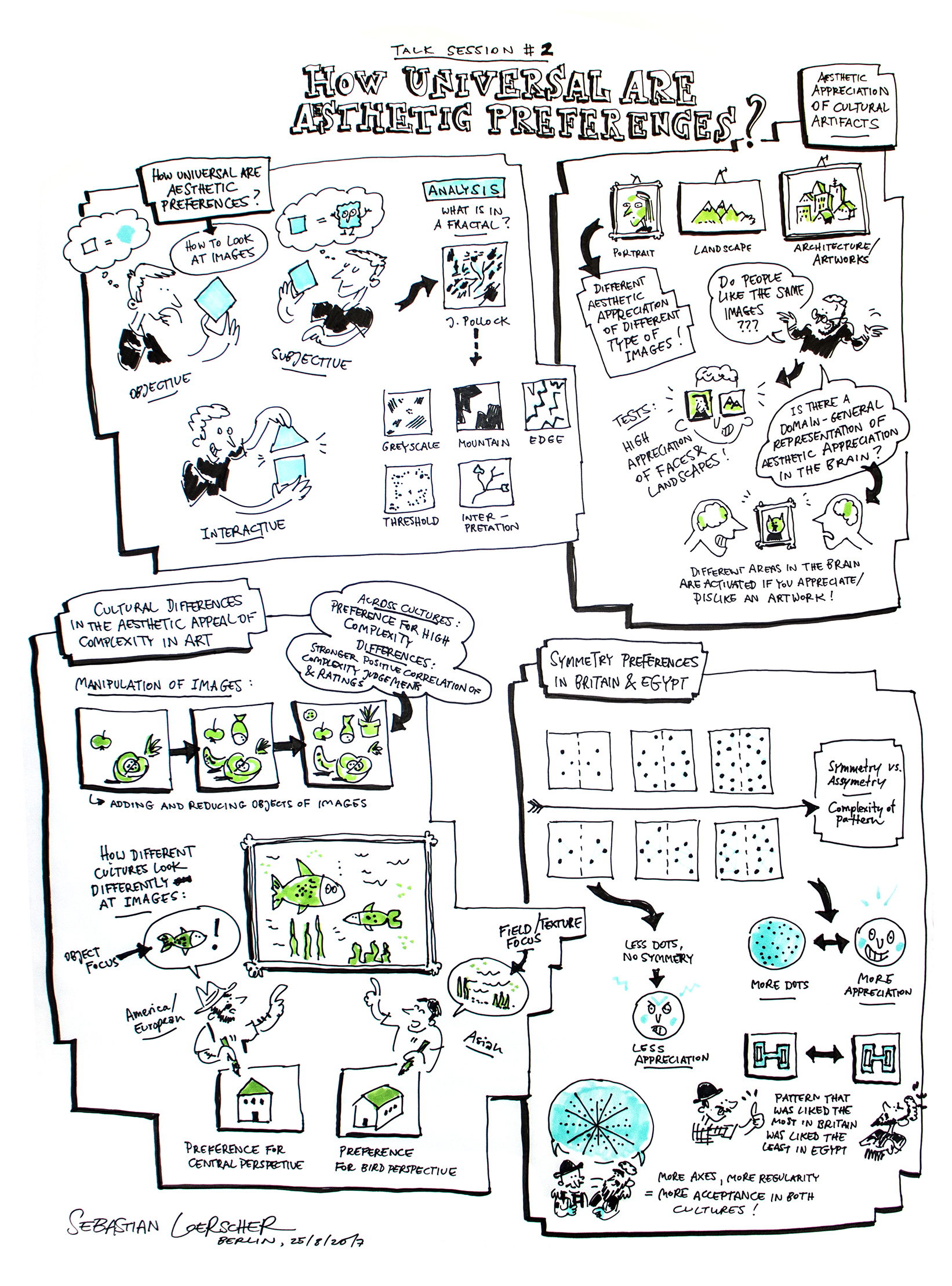
The field of empirical aesthetics has long been divided as to whether aesthetic preferences are best considered universal or individually and culturally specific. Preoccupations with either the universal canons, or with the highly variable individual differences in aesthetic experience remain the widespread reflections of these opposing views. Typically, the very existence of individual differences is considered an obstacle in attempts to identify the universal mechanisms mediating aesthetic preference. We take an integrated approach, based on our findings that there is seemingly universal preference for certain types of spatial (fractal) structure in visual images and that there is a strong association between visual preference and visual sensitivity for such image properties. Furthermore, by measuring aesthetic preference and visual processing in the same participants, with a range of distinct image categories, and across different sensory modalities, we use the individual differences approach as a window into the mechanism mediating the relationship between perception and aesthetics. In particular, we use the dimensional structure modeling of individual differences in patterns of aesthetic preference across different image types and sensory modalities to isolate the mechanisms mediating and determining both universal and individualistic components of aesthetic experience for different types of spatial structure. In doing so, we re-conceptualize the nature of visual appeal in terms of perceptually- rather than semantically- based processes, and argue that perceptual processing of aesthetic object's properties and the resulting affective responses are directly related.
Aesthetic appreciation represents a fundamental mode of human interaction with the visual world, yet the processes that support such experiences are poorly understood. Given that individuals can be aesthetically engaged by a diverse array of visual objects (paintings, mountain vistas, etc.), we sought to test whether aesthetic appreciation of widely different visual domains relies on the same underlying processes. Behaviorally, we find that the degree of shared versus individual aesthetic preference differs systematically across domains. Preferences for faces and landscapes contained a high proportion of shared taste, while preferences for architecture and artworks, both artifacts of human culture, reflected strong individual differences. Brain imaging studies with artwork reveal both an “early” process that links ventral visual pathway representations with liking and a later, prefrontal process that is only engaged by aesthetically moving stimuli and may recruit portions of the default-mode network (DMN), which is typically only engaged by internally (self) directed attention. We measured brain activity (fMRI) as 16 observers made aesthetic judgments about architecture, natural landscapes or artwork. Using multivariate pattern classification, we found a signature of “domain-general” information about aesthetic appreciation in portions of the DMN. A “searchlight” analysis revealed additional prefrontal regions whose activity only reflected information about the aesthetic appeal of either artwork or architecture. These results suggest that visual aesthetic engagement recruits a core set of domain-general processes, but that aesthetic evaluations of cultural artifacts rely more heavily on individual aesthetic sensibilities than do evaluations of landscape, and also engage additional processes in prefrontal cortex.
Since the seminal work of Berlyne, researchers think that complexity affects aesthetic appreciation. In European art, complexity is often a positive feature. The art historian Mary Carruthers (2014), argues that variety is foundational for Western aesthetics. In contrast, simplicity and complexity are traditionally positive values in Japan. Here, we test these culture-specific links between complexity and aesthetic valuation. Twenty non-abstract paintings (half Japanese, half European) were manipulated in complexity across three dimensions (number of objects, number of textures, amount of empty space). 33 German and 30 Japanese participants rated all 60 images on perceived complexity. An independent sample (33 German, 26 Japanese) evaluated them on liking, interest, beauty, and value. Earlier studies found no correlation between complexity ratings and aesthetic evaluation in artworks (Nadal 2010). In contrast, we found positive associations between complexity and all aesthetic evaluations in both countries when the number of textures was manipulated (0.55 < r < 0.78, all p < 0.018). In contrast, Japanese participants gave similar ratings to paintings with few or many objects, and with considerable or limited empty space. This pattern of cultural differences deviates from some earlier studies outside of the artistic domain. When real artworks are used, Japanese people only sometimes prefer high but never low complexity. Western Europeans always prefer high levels of complexity.
Symmetry has often been associated with beauty. To what extent this appeal is universal is a difficult question to answer. From a theoretical perspective, cross-cultural comparisons are important, because similarities would support the universality of the response to symmetry. Some pioneering work has focussed on the study of preference for abstract shapes in Britain and Egypt (Soueif & Eysenck, 1971; 1972), including both experts and naive participants. Due to the nature of Islamic art over the centuries, abstract patterns are particularly relevant for this comparison. These studies confirmed general agreement across cultures. We revisited this comparison after almost half a century but with stimuli that more carefully avoided possible sematic associations. We compared preferences in naïve participants in Egypt (n= 200) and Britain (n= 200) for 6 different classes of symmetry using black-and-white patterns. In addition we used three measures of complexity: Gif ratio, Edge length and Average region size. The results support the presence of a similar pattern of preference for symmetry, and in particular a preference for reflectional symmetry. Apart from symmetry, there was also a preference for simplicity in Egyptian data (and not in the British data), something already noted by Soueif & Eysenck (1971). Therefore we confirmed both universal and culture-specific aspects of visual preference.
Helmholtz was surprised that his visual field appeared to be much narrower (roughly 90º) than his actual field of view (about 180º). Indeed, we find that human observers tend to experience their “visual rays” as a roughly parallel beam instead of concurrent with the vantage point. Moreover, people refer visual directions to these apparent visual rays, giving rise to errors of 100º and more. Seen pictures rarely subtend more than about 40º, although modern techniques allow one to depict the full (360º) horizon. Such pictures are rapidly becoming popular, but it is hardly surprising that visual awareness is unable to deal with them appropriately. In an empirical study we detect errors due to an agnosia with respect to the topology of the optic array. One class of errors has to due with the nature of the picture frame, a categorically different class has to do with the mismatch between the topology of pictorial (or visual?) space and the optic array. Apart from these major problems, there are also the aforementioned errors due to the external local sign. We speculate on useful (and visually attractive) alternative ways of depiction.
Prior to the discovery of linear perspective in the fifteenth century European artists based their compositions on imagination rather than the direct observation of nature. Medieval paintings, therefore, can be thought of as ‘mental projections’ rather than optical projections, and were often regarded as ‘primitive’ by historians since they lacked the spatial consistency of later works (Meiss, 1946). There are noticeable differences in the way objects are depicted in paintings of the different periods. For example, human figures in pre-perspective works are often painted significantly larger than we might expect from their surroundings (Bunim, 1940). Art historians have usually attributed this to ‘hierarchical scaling’ where figure size is proportional to narrative importance, but there are many examples of paintings where this cannot be the explanation (White, 1973). I will consider an alternative hypothesis: that medieval artists used relative scale to manipulate attention and empathy, an idea proposed by the art historian Oskar Wulff (1907) but largely dismissed since. Far from being primitive, I argue artists of this period used sophisticated techniques for directing the attention of the viewer to a particular figure in a painting and encouraging them to ‘see’ the depicted space from that figure’s point of view. I will offer some experimental evidence in support of this hypothesis and suggest that the way artists have depicted space in paintings has an important bearing on how we imagine and perceive visual space.
“We know that behind every image revealed there is another image more faithful to reality, and in the back of that image there is another, and yet another behind the last one, and so on, up to the true image of that absolute, mysterious reality that no one will ever see.” – Michelangelo Antonioni - In 1937, Disney created his version of the multiplane camera and produced films like Snow White, Pinocchio, and Bambi. The multiplane camera creates a three dimensional effect by moving picture planes in front of the lens at various speeds and at various distances from one another. For the first time, a coherent and convincing three-dimensional virtual space could be experienced within the two-dimensional framework of the cinema. A space that only can emerge by adding time to the two-dimensional planes. Nowadays, encircled and encapsulated by the virtual world via our ever-present flatscreens, the surprise of this virtual world is long gone. Time and space, fact and fiction, have become as moldable as a piece of Play-Doh. We will present a selection of our video works in which we have used the technique of the multiplane camera, recreated in a digital environment. In a complex, often fragmented architecture of carefully placed planes, we created an alternative time that provides room for reflection and, at the same time, shows its construction.
The synopter is a viewing device that eliminates cues signaling non-pictorial depth. It renders the physical flatness of a picture invisible, resulting in a depth presentation that only contains pictorial cues. Theoretically this should lead to a ‘better’ perception of pictorial space. But what exactly gets ‘better’? How can we describe the difference between synoptic pictorial space, and normal binocular viewing of pictures? Previous studies have primarily focused on depth, and revealed perceived depth ranges increase when viewing with a synopter. Related studies on ‘monocular stereopsis’ contested this quantitative increase and instead found a qualitative increase of depth. Although the nature of synoptic depth changes remains inconclusive, the findings do articulate the difficulty of describing synoptic pictorial space. We are interested in what observers spontaneously report when looking through a synopter. Moreover, we are specifically interested in pictorial spaces of paintings, because these show a larger and more interesting variety in pictorial cues than photographs. We previously studied synoptic art viewing using digitally reproduced art works. In the current study we investigate the perception of original artworks observed in museums. By letting observers describe the changes they see when looking with and without synopter we may reveal both depth-, but potentially also light- and material-related changes of pictorial space.
Since the pioneering work of Buswell and Yarbus, there has been a growing interest in studying characteristic fixation patterns on paintings to understand perceptual and cognitive processes contributing to aesthetic experience. Conventional eye tracking methods, carried out in the laboratory, limited such work to static observers looking at reproductions of art works under well-defined viewing conditions. Mobile eye tracking now allows us to study the experience of a visitor roaming in a gallery interacting with paintings. We used a TobiiGlasses2 system to study eye movements on two abstract paintings by Jackson Pollock, (‘Mural’ 1943, ‘Blue Poles’ 1952), displayed in the exhibition ‘Abstract Expressionism’ at the Royal Academy (London), where participants could walk around freely looking at these paintings. We collected a rich data set with 24 observers, recording (approximately 4 minutes with 8,000 fixations) for each painting. The recordings revealed intense interaction with the artworks, characterised by extensive head and body movements (changing gaze position, and head/body yaw, pitch, and roll) that affect viewpoint, orientation, distance and illumination of the painting – all of which are controlled in the lab but essential for the natural experience of art. Recorded gaze locations were used to derive spatial distributions of fixations on the painting, which were visualised as aggregated ‘heat maps’ for each painting and observer, as well as group averages. Despite considerable individual variations, there are typical hotspots of fixations on geometric singularities or areas that resemble familiar objects embedded in these abstract paintings which were not observed in lab-based controls.
Contemporary pictorial art is often challenging for the viewer and provokes a wide spectrum of cognitive and emotional reactions that range from interest and surprise to confusion and anger. The aim of the present study is twofold. Firstly, it is to identify oculomotor strategies applied when facing semantic and syntactic violations present in the selected contemporary paintings. Secondly, it is to assess the influence of the possible factors that mediate one’s reaction to these paintings. The main hypotheses are that (1) semantic violations are associated with a focusing strategy (few long fixations), whereas syntactic violations are associated with a scanning strategy (many short fixations) and (2) these effects are mediated by individual differences related to one's ability to manage conflictual stimuli (e.g. need for closure and the level of art expertise). The subjects’ eye movements and verbal reports were recorded when they viewed digital copies of contemporary paintings (4 groups differing in presence of semantic and syntactic violations). The preliminary results suggest that syntactic and semantic inconsistencies influence eye movements differently and that need for closure as well as art expertise contribute to both eye movements and subjective experience of intelectually taxing and demanding pictures. The role played by these factors in reception of contemporary art is discussed.
Observers like shapes with smooth curvature, as opposite to sharp angles. This has been confirmed with a variety of visual stimuli: familiar and unfamiliar objects (Bar & Neta, 2007) abstract shapes (Bertamini et al., 2015; Silvia & Barona, 2010) and interior design environments (Vartanian et al., 2013; Leder & Carbon, 2005). The origin of this phenomenon is debated (Gomez et al., 2016). In the current studies preference for curvature has been explored using explicit and implicit tasks (Palumbo et al., 2015; Palumbo & Bertamini, 2016). In Study 1, stimulus time exposure and type of response (rating scale vs. forced choice) did not modulate preference for abstract irregular shapes. In Study 2 curved shapes were automatically associated with positive (and with safe) concepts and angular shapes with negative (and dangerous) concepts (Implicit Association Task). However, in Study 3 angular shapes did not elicit avoidance, whereas curved shapes triggered approach (Stimulus Response Compatibility Task). Study 4 replicated this pattern of results with an emotional modulation paradigm (Bamford et al., 2015) in combination with EEG recording. Specifically, the amplitude of the Late Positive Potential (500ms after stimulus onset over parietal sites) increased when participants approached compared to when they avoided curved shapes. In contrast, with angular shapes no difference between approach and avoidance was found. Further research will clarify the nature of the emotional response for curvature and its relation with context, individual differences and expertise, but converging evidence shows a clear and robust positive response and approach to smooth curvature.
It has become more and more common for a number of art historians and artists to do research with the use of equipment monitoring electrical activity of the brain. Quite often, electroencephalography can provide interesting facts about neurophysiology both of the artist and the viewers. This is precisely the reason why it seems worth comparing different devices in order to formulate some conclusion and classification. In my speech, I would like to compare three types of devices (Mind Wave Mobile, Emotiv Epoc, B-Alert x24) and, subsequently, try to provide an answer for the question: Which of them – and why – is the best for analysis and documentation of performative art? For this purpose, I wish to provide documentation from four different performative actions. As for my analysis, it will be based on a comparison involving several variables, such as: technical specification of tools, quality of connection with the device, quality of recorded data, usefulness/friendliness of the software, capability to work inside or outside, convenience of use. The data which I intend to use comes from the device, the artist, the viewers, and the producers of EEG equipment. I find it essential to compare and make such classification for a number of reasons. Firstly, thanks to this, it will be possible to verify different art projects in which artists use the same EEG tools. Secondly, art historians need some kind of translation from neuroscience language. Finally, we seem still lacking satisfactory methods of documenting modern performance art.
The experience of beauty is a pleasure, but common sense and philosophy suggest that feeling beauty differs from sensuous pleasures such as eating or sex. Immanuel Kant claimed that experiencing beauty requires thought but that sensuous pleasure can be enjoyed without thought and cannot be beautiful. These venerable hypotheses persist in models of aesthetic processing but have never been tested. Here, participants continuously rated the pleasure felt from a nominally beautiful or non-beautiful stimulus and then judged whether they had experienced beauty. The stimuli engaged various senses and included seeing images, tasting candy, and touching a teddy bear. The observer reported the feelings that the stimulus provoked. The time course of pleasure, across stimuli, is well-fit by a model with one free parameter, pleasure amplitude. Pleasure amplitude increases linearly with the feeling of beauty. To test Kant’s claim of a need for thought, we add a “2-back” task, which distracts the observer’s thoughts away from the stimulus. The task greatly reduces the beauty and pleasure experienced from stimuli that otherwise produce strong pleasure, and spares those of less-pleasant stimuli. We also find that strong pleasure is always beautiful, whether produced reliably by beautiful stimuli or occasionally by sensuous stimuli. In sum, we confirm Kant’s claim that only the pleasure of feeling beauty requires thought and disconfirm his claim that sensuous pleasures cannot be beautiful.
Aesthetics research is mainly concerned about understanding art experience. Although there is clear cultural as well as empirical wisdom that such an experience is essentially biased or even undermined by ecological factors, most research is still conducted in unfavourable and misleading ways: Art experience is mostly investigated in 1) artificial labs contexts with 2) settings which do not show typical motivation, interest and effort which we typically face in art galleries, tested with 3) material which is quite different to original artworks. For instance, art experience in museums and galleries is marked by multiple inspections, self-driven selection and long-lasting considerations of artworks. Typical art contexts frame works as true works of art, making it unambiguously clear that beholders look at esteemed masterworks. Art gallery visitors show high motivation to experiencing art with expectations of perceiving extraordinary works. Lastly, original art works are differently staged, show real object qualities and are presented in original sizes and material, which is very different to their experimental counterparts in lab research. In the present paper I am compiling evidence from recent research how these dimensions can affect or even fully change art experience and why we should be very careful in interpreting results from studies ignoring these dimensions. Many studies in the domain of empirical aesthetics might be misleading for the understanding of art experience as they ignore the specific framing and meaning of artworks and their extraordinary and unique cultural status that make artworks so different to ordinary objects of everyday life.
Portraits in general are an interesting genre because they transcend the asymmetric subject/object relation, of the conscious viewer to inanimate objects and scenes, at multiple levels. A first level is that they depict a live, autonomous organism rather than a static object. A second level is that they imply a gamut of potential interactions with us as viewers (although even static objects imply a range of affordances of how we might interact with them). A third level is the implied consciousness of the sitter, which may have an array of manifestations, from welcoming to disdain, for example. This opens the possibility of a fourth level of allusion the dyadic interaction between the consciousnesses of self and other, as each is conscious of the other’s consciousness of themselves, and to the implications of those reflexive consciousnesses in informing their own sense of self-consciousness. The final level I will explore is whether artists can hope to capture some of the complexity of such dyadic inter-reflexivity in the inherently static image of self-, or auto-portraiture, and whether perusal of artists’ self-portraits allows us to enter the self-reflexivity of the artists’ contemplation of themselves in self-portraits, treated as a projective interpolation of the dyadic interaction with others onto their own self-reflection (or auto-regressive eigenfunction). This analytic framework will be brought to bear on the analysis Italian and German self-portraiture over the past half-millennium, and on the eye-centering principle of portrait composition as a “sweet spot” that maximally evokes this dyadic interplay of consciousnesses.
Photography as an art form is not only aimed at capturing some aspect of reality (e.g., people, landscapes), it sometimes also yields more abstract images. As other visual artists, art-photographers often seek the edge of attractive chaos, trying to strike a balance between covering and uncovering organization and meaning. In a cross-over collaboration between artists and scientists, we wanted to better understand the role of indeterminacy and the balance between order and complexity in a series of 24 semi-abstract images, derived from photographs of everyday objects (e.g., books) or scenes (e.g., corn fields), with intentional variation of order and complexity, as well as recognizability. In an online survey, several hundreds of participants, who varied greatly in art background and experience, were asked to rate all photographs on four bipolar 7-point scales (simple-complex, boring-interesting, ugly-beautiful, unpleasant-pleasant). The edge of attractive chaos differed between photographs and individuals. In general, the subjective rating of complexity determined appreciation more strongly than the quantitative indices computed on the images (anisotropy, fractal dimension, Fourier slope, PHOG complexity). On average, more complex images were judged as more interesting, more beautiful and more pleasant. While the correlation between complexity and interestingness was high and stable regardless of the participants’ background, the positive relation between complexity and pleasantness/beauty was markedly higher for participants with higher affinity for art. This is in line with the hypothesis that the more experience you have with art, the more you will be able to handle and appreciate more complex images.
The role of artistic capabilities in the creation of abstract artworks is a matter of debate. Research suggests that the cognitive appreciation of art depends largely on expertise. However, only few studies have focused on the creation of artworks. While some studies have found a correlation between creativity, personal attributes and intelligence levels (Zaidel, 2014), other studies established a link between local visual processing ability and drawing skills (Chamberlain, 2015). Nonetheless, not much is known about the role of expertise in the production of art. Here, we asked 16 experts and 16 lay persons to create 10 abstract images by arranging given pictorial elements (30 elements per image). Afterwards, we measured the statistical image properties of the created images. We found that artists created less self-similar images with a higher affinity to the rule of thirds. In a follow-up experiment, we investigated whether independent observers can detect the compositional differences between the images that had been created by artists and lay persons. We found that 20 naïve participants sorted 57.5% of the images into the correct category. Therefore, we conclude that artists and lay persons compose images differently, and that naïve observers can detect these differences in the created artworks.
By pairwise comparison of edge orientations across an image, we have recently shown that edge orientations are largely independent of each other in traditional visual artworks of Western, Islamic and Chinese provenance (Redies et al., 2017, Vis. Res. 133, 130). Moreover, these categories of artworks are characterized by an intermediate degree of subjective complexity, as measured by the fractal dimension, and intermediate to high self-similarity of luminance gradients. Here, we extend the study of these image properties to two types of artworks that we expected to deviate from traditional art: (1) so-called Bad Art from two museums that collect contemporary artworks of lesser importance (MOBA museum and OBAMA museum), and (2) abstract art from two prestigious museums (Tate Gallery and NRW Collection). In the multidimensional space that is defined by the above image properties, we measured the Mahalanobis distance of each artwork to the cluster of traditional artworks. Results reveal that, although there is a considerable degree of overlap between all three types of art, many examples of Bad Art and abstract art deviate from the pattern of image properties that characterizes traditional art. We speculate that some artists who created Bad Art failed to produce images with the structure of traditional artworks due to lack of artistic training, whereas some abstract artists deliberately turned away from the traditional art style. In conclusion, our study suggests that objective image properties allow distinguishing traditional artworks from artworks that are of lesser artistic importance or follow other aesthetic principles.
Over the last twenty years a number of studies have analysed the image statistics of artworks to test whether the mark-making choices of artists can be described, at least in part, in terms of certain mathematical rules governing image content, and human aesthetic responses to that content. Debate in the field is still ongoing, and is driven partly by three unresolved questions: (i) How do different statistical measures compare? (ii) Are artistic choices influenced in some way by the values of particular visual statistics? (iii) Do the values of particular visual statistics bear any relation to viewer responses to artworks? This research attempted to address the questions by analysing 476 Western artworks dating from 1435 to 2008, drawn from the JenAesthetics and MART datasets. Results showed that: (i) There are moderate correlations at best between the values of three different luminance statistics (Fourier spectrum slope, fractal dimension, and Shannon entropy), so they cannot be considered as equivalent and measuring the same image properties; (ii) Statistical values are relatively stable over time and over art genres until the advent of abstract art in the early 1900’s. (iii) Across the full image set there is no clear and simple relation between image statistics and viewer responses.
Aesthetic experiences are determined by bottom-up and top-down influences. We studied the effects of affect-related personality traits in relation to complexity and arousal responses to affective visual and musical stimuli in the context of Berlyne’s psychobiological model (1971). Two hundred and six females rated environmental scenes, environmental scenes converted into cartoons, and representational paintings (Exp. 1). Another group of 77 females rated excerpts of piano music (Exp. 2). We assessed trait emotional intelligence (EI), stress reactivity (SR), empathy (Exp. 1), emotional self-efficacy (Exp. 2) as well as engagement with art and music. Linear-mixed effects modelling revealed that affect-related traits emerged as significant predictors in all visual complexity and arousal models, except for the complexity model of environmental scenes. SR was a predictor of arousal induced by environmental scenes, but not for cartoons and paintings, for which an interaction between trait EI and empathy was found. Musical sophistication predicted musical complexity, and the complexity and arousal models comprised interactions between trait EI, SR and emotional self-efficacy. Affect-related traits should be integrated into arousal-based theories of aesthetic experiences. The impact of these traits on aesthetic experiences varies across stimulus categories.
Research frequently associates high appeal with order, predictability, and processing fluency whereas interest requires increased complexity together with a promise that engagement leads to new insight (e.g., Berlyne, 1971; Muth & Carbon, 2016; Silvia, 2005). Such a potential can be realised by divergence from simple order that still makes us anticipate or associate familiar structures, e.g., a complex or flawed order in a pattern. Nine participants produced appealing or interesting patterns blockwise by rotating basic elements via the program Flextiles (Westphal-Fitch et al., 2013). 20 independent participants evaluated 108 of these images blockwise on various dimensions via a 7-point-scale. Patterns that were intended to appeal were of significantly lower estimated complexity (difference=1.35, Cohen’s d=1.67) and significantly more likely to contain detectable order than interesting patterns (difference=2.10, Cohen’s d=.1.30). Also, obviousness of order was significantly higher in appealing patterns (difference=2.12, Cohen’s d=1.56). We also detected a strong positive correlation between subjective complexity evaluations and interest (r=.735) versus a weak negative one with liking (r=-.309). And pictures were more interesting (r=.434) but less appealing (r=-.368) the longer it took to detect order. Obviousness of order was accordingly negatively linked to interest (r=-.529) but positively to liking (r=.473) and stimuli with flaws were more interesting (r=.424) but less appealing (r=-.494). We suggest that interest is influenced by both, association with but also complication of order motivating engagement in finding (new) order whereas liking might be linked to obvious order and might rather reflect spontaneous judgements about an object’s features than a motivational state.
The variety and diversity of fruits and vegetables on display in today’s supermarkets is enormous. Products come with differences in size, shape, color, flavor, production and trading method. In this study (N=40) we investigated how variation in color may lead consumers to anticipate differences in product properties. We studied a common vegetable – carrots – generally available mainly in orange, but actually supposed to appear in many different shades. Pictures of carrots (k=9) with approximately the same shape were presented on a color calibrated computer screen. On 7-point scales 14 expected properties, familiarity, purchase intention, and intended preparation method were rated for these carrots. In addition, they reported spontaneous associations for each variety. The outcomes indicate that colors have substantial impact on consumers’ expectations about sensory and functional properties, including freshness and nutritional value. We found most positive evaluations for orange carrots, which are most familiar, attractive, nutritious, healthy, fresh and sweet, and low in sourness, bitterness and spiciness. Carrots in atypical colors were rated unfamiliar and artificial. For instance red carrots (unfamiliar) were rated high on spiciness and taste intensity, yellow carrots (artificial/unfamiliar) were low on taste intensity. Some expectations may be derived from associations to other vegetables with similar shapes or colors. However, low attractiveness ratings suggest that consumers may be reluctant to try unfamiliar variants. Although atypical colors produce opportunities for culinary applications, commercial success in mainstream supermarkets may be currently limited, until consumers have integrated them into their habits.
We investigated whether the background color and the background saturation of furniture pictures influence processing speed, memory capacity and aesthetic judgment of these pictures. According to the perceptual fluency hypothesis of aesthetic experience, high contrast pictures (e.g., black pieces of furniture with unsaturated background) should enhance processing speed, induce a stable memory representation, and should be judged as more aesthetic compared to low contrast (e.g., saturated background) pictures. In addition, arousal theories of aesthetic experience assume that a heightened arousal level (e.g., red background color) should induce a faster processing and a higher level of aesthetic judgment compared to a lower arousal level (e.g., blue background color). We tested these predictions by presenting black pieces of furniture on different backgrounds and required a speeded discrimination of whether the furniture was a chair or a table. Following this category discrimination task, a recognition memory task with pieces of furniture on white background was used and participants rated their aesthetic impression. In line with the fluency theory, the results showed that high contrast pictures were processed faster, remembered better and judged as more aesthetic than low contrast pictures. Color of background did not influence any dependent variable. Taken together, the results support the idea that easy processing of stimuli contributes to an enhanced aesthetic impression.
The artists of the modernist De Stijl movement argued that a painting is a flat plane and should look like one. .They aspired to create purely two-dimensional compositions and to achieve a flatness and absence of depth as complete as possible. According to one of the most prominent artists from this group, Piet Mondrian, referring to a painting By Huzsa (1919) “the overlapping planes in the painting showed an illusion of depth that should be avoided in modern art”. Mondrian experimented with different coloring and compositional techniques finally dividing fields of colour by a black raster or grid of horizontal and vertical lines. The use of a grid has been widely credited with the dissolution of the illusion of depth in Mondrian paintings. (e.g. von Campen,1997 ), so that a visually flat composition is achieved. Here we investigate the perceived flatness in original Mondrian compositions compared to the three novel variants: 1) grid removed 2) grid removed but colour partitions as in the original composition 3) grid removed and subtle occlusion cues (t-junctions) between differently colored partitions introduced. Our results show that except in variants with explicit occlusion clues, there was no significant decrease in the perceived flatness as the grid was removed, especially if the number of plane partitions was kept the same as in the original painting. Nevertheless, the compositions with grid intact were rated as more aesthetically pleasing than their counterparts with the grid removed.
When teaching a multidisciplinary group of undergraduates a course on the science of colour perception, great value was found in using examples from modern art, in particular the light art of Olafur Eliasson. For many key concepts in colour science, examples from the field of light art were found which presented key scientific ideas in a clear and engaging manner, that complemented that of a traditional demonstration. For example, photographs of Eliasson’s installation artwork, ‘Reality Machines’ were shown to introduce the concept of subtractive colour mixing. In this artwork, a room was filled with partitions made of strongly coloured transparent plastic sheets. Upon first inspection, the room seems to be filled with many colours, and only upon closer inspection it becomes apparent that all the colours are created only by overlapping combinations of cyan, magenta and yellow sheeting. I will argue that such apt examples exist, because in the field of perceptual studies, both artists and scientists deliver valid perspectives from within the traditionally scientific roles of researcher, experimenter and communicator. Further, installation and light art often focus on studying the action of the observer; a subject clearly key to the pursuit of perceptual sciences. Finally, I shall consider how greater integration of the arts and sciences can inspire novel teaching methods for the traditionally scientific subject of colour science, particularly the employment of research-based teaching methods.
When observing Frank Stella’s (°1936) Irregular Polygon paintings, which consist of both fluorescent and conventional colours, it is common to experience the illusion of colour depth based on their interaction. In an experiment, we wanted to find out whether or not artists and non-artists, experience fluorescent colours as protruding, receding or flat when viewed in combination with conventional colours. We also wanted to find out if they still experience colour depth when all fluorescent colours are replaced with their conventional variants. For the experiment, we isolated the colour combinations of four Irregular Polygon paintings and placed them next to each other, avoiding influences from shape and texture. The relative sizes of each of the coloured areas were taken into account when designing the stimuli. Because fluorescent colours cannot be shown on computer screens, all the stimuli were screen printed manually on large scaled paper. Participants had to observe fifteen prints shown one by one and they had to rate the depth experience of each coloured region with a number between -3 (strongly receding) and +3 (strongly protruding). The results reveal that most participants experience the fluorescent coloured regions which are visible in the longer wavelengths (yellow – orange – red) as protruding. The conventional colours showed a similar but smaller effect. In addition to discussing the perceptual results, we will illustrate the relevance of this experiment for a correct reading of fluorescent artworks and for the (re-)assessment of the historical critique that pertains to them.
While artists and architects have been aware of the importance of specifically-oriented stimuli for millennia, only recently neuroscience has started examining the effects of art on psychological and neuronal states. For example, although there are some reports on effects of perceived colors on mental and physiological functions, such as color stimulation effects on muscular tonus, posture, and the perception of time and space, as well as subjective time; experimental studies of these effects seem to be rather rare. Here, we review recent results related to the OVO, a unique environment of Whole Body Perceptual Deprivation (WBPD) in the shape of a human-sized egg, aimed at inducing reflectivity, relaxation and healthy neuronal synchronization. Current studies have examined the effects of the OVO have demonstrated changes in the perception of time, as well as subjective temporal and spatial experience. In turn, these were accompanied by electrophysiological alterations in alpha (8-12 Hz) band. In relation to color stimulation, the examination of the electrophysiological effect of color stimulation inside the OVO has demonstrated that being immersed in blue light elicited increased theta (4-7 Hz) compared to being immersed in red light, especially in areas related to visual perception and synesthesia. In conclusion, the OVO can produce a specific neuronal and behavioral response. Understanding the effects of specific characteristics of the stimuli and the possible underlying mechanism may aid artists, architects and therapists choose the best stimuli, in order to orient themselves and the other towards the inner state that they would like to achieve.
Mondrian claimed that real harmony and balance could only be expressed through art (Mondrian, 1942). Studies varying his original paintings through rotation, minimal shift or exchange of colours showed a consistent preference for originals (e.g., Latto et al., 2000; McManus et al., 1993; Locher et al., 2005). Participants’ determination of the paintings’ centre of balance and their eye movements also differed between originals and their variations (Locher et al., 2005; unpublished study by Locher). Major aim of our two present experiments was to replicate the unpublished study by Locher. Nine original paintings – each along with five variants resulting from exchanging the colours – were used and participants’ task was to determine either the centre of balance or the location where all colours were in balance, harmony and liking. In both experiments, variants were not different from originals in terms of all key variables but harmony. For harmony, we even obtained an opposite pattern as expected, with variants being assessed as more harmonic than the respective originals. Eye movements did not differ between originals and their variants, but were in general more widespread when participants had to judge where the colours were in balance. Our findings indicate that Mondrian’s paintings might have been quite harmonic but still not perfectly harmonic artworks - as previously and still often claimed.
Ambiguous figures can be seen in multiple ways, e.g., the famous rabbit-duck figure can be seen as a rabbit or a duck. Prior knowledge may bias observers to see one of the possible interpretations of ambiguous figures. Here, we used ambiguous figures to probe the suggestibility of peripheral vision by investigating to what extent the vague percept of a peripheral stimulus can be modulated by prior knowledge. Art students were presented with ambiguous figures in the right visual field. Eye tracking ensured that the stimuli were only presented when observers kept fixation. Participants were asked to draw as accurately as possible how a stimulus looked like. Half of the participants were told that the figure was one interpretation, the other half was told that it was the other interpretation. The majority of the resulting drawings did not exhibit the ambiguity of the presented images. Instead, many of the drawings strongly resembled (idealized versions of) the interpretation given in the instruction, and not the alternative. However, this was the case only if observers could perceive the given interpretation of a figure -- defining features of the alternative interpretation were lost in the absence of conscious recognition. Our results reveal the malleability of peripheral vision by prior knowledge, and provide pictorial representations of a range of interpretations of peripherally presented ambiguous figures. We propose that the peripheral ambiguous drawing task can be used to estimate the extent to which artists are able “to draw what they see” compared to “what they know”.
We investigated the influence of auditory input on the appreciation of paintings. We were interested whether the judged beauty of a painting was influenced by the fit between tonality and painting or by the tonality per se. We first tested the influence of major and minor chords, played simultaneously with selected portraits (portraits were pre-classified by means of an internet-based survey as having ‘positive’, ‘negative’ or ‘neutral’ appearance). When participants rated the beauty of the chord/painting combination the results revealed a clear interaction between chord type and portrait appearance with highest scores for the combinations major/positive, and minor/negative. However, when the participants rated the beauty of the painted portraits while still hearing major/minor chords, all paintings were rated higher when major chords were heard. In a second set of experiments we explored the generalizability of this finding, by having different sets of chords and paintings. We now included portraits, landscapes, and abstract paintings (and a no-sound condition). The results were replicated for faces and landscapes. For the abstract paintings, however, we found an interaction for both rating conditions (‘chord-and-painting’ vs ‘only-the-painting’). The findings suggest that beauty judgements of paintings with a clear semantic content do not depend on the perceived fit between auditory tonality and the visual image. Rather, the tonality tends to bias the judgements of the paintings in the direction of the auditory valence. In contrast, the evaluation of abstract paintings appears much more sensitive to the apparent fit between sound and vision.
Graphs are abstract representations of complex object-relation structures; graph visualisations used in virtually all fields of science, from physics and biology, over psychology, up to humanities and social network analysis. Kurosu and Kashimura (1995) confirmed that aesthetic qualities play a major role in usability—and thus, understanding. Our study (n=122) aimed to test the first impression as well as second stance aesthetics of graph visualizations regarding the variables curvature, beauty, complexity, and interest. We organized the study as two blocks: First, we delimited the presentation time to 100 ms; in the 2nd block participants had unlimited time to respond to the respective variables. We employed graph visualisations with 16 different characteristic outlines, varying from simple rectangular and round to rather complex shapes resembling ink plots and geographical demarcations. In a control study (n=111), another group received the same task, but stimuli were now filled with grey. We detected a significant correlation between curvature and beauty, both in the first-impression and in the unlimited-time part, for the graphs as well as the shapes. Remarkably, the relation was strongest for graphs shown without time restriction. Complexity, in general, was a good predictor for interest. We conclude that general findings from cognitive science, for example the positive relation between curvature and beauty, do apply (and might even be stronger) for the visualization of complex information. This suggests that a transfer from empirical aesthetics to the field of data visualization is a promising avenue for assisting the enjoyment and understanding of graphs.
How influential is subject matter in guiding visual art preference? Relevant to this question is Palmer & Schloss’ (2010) ecological valence theory of aesthetic preference, demonstrating that color preferences are predicted by individual’s preferences for the objects associated with the colors. Here, we tested the extent to which preferences for visual artworks are shaped by preferences for the objects depicted in the art. Our study consisted of three phases: in the first phase, 20 Occidental College students viewed 68 representational artworks spanning styles and periods, and tagged the artworks with salient features and associations. In the second phase, 50 new participants rated their preferences for the same set of paintings, and in another block rated their preferences for the object tags generated the first phase. A final set of participants rated how well the tags represented each image, allowing us to compute weights for each object tag. Supporting our prediction, we found that average preference ratings for each painting were strongly correlated to average preference ratings for the depicted objects (r [66]= .56, p < .0001). Moreover, the correlation improved when weights were assigned to each tag (r [66]= .61, p < .0001). This work adds to the body of research concerned with the processing of visual art and supports the idea that, although art preference is subjective, subject matter is a significant influence in the formation of preferences.
This research investigates human visual affective responses to images of various kinds of curves. We are focusing on “predictability” of the shape of curves. A curve is predictable if the evolution of the curve can be extrapolated by the prediction of human vision. We have assumed a hypothesis that a curve that is not trivially simple but predictive is more attractive than both regular curves whose evolution is simply obvious and irregular non-predictive curves. We evaluated the attractiveness of the curves by estimating the activity of the sympathetic nervous system using a wearable vital sensor, to avoid subjectivity on the evaluation of attractiveness. We obtained the electrocardiogram of respondents during watching animations of evolving curves. The R-R intervals of the electrocardiogram were measured and transformed into the frequency domain, and the LF/HF ratio was calculated. It is known to be indicating the activity of the sympathetic nervous system. Animations containing each of a closed curve of regular vibration, that of linearly extending vibration, that of extending and shrinking vibration along a quadratic function, and that of irregular random vibration, were presented to respondents in a darkroom. The number of respondents was 30. The results indicate that the LF/HF ratio was marginally significantly higher when the curve modulated by a quadratic function was presented than in the cases of regular and irregular curves. It suggests that the activity of the sympathetic nervous system tends to be higher in the case of viewing a curve that is not trivially simple but predictive.
Several studies have shown that humans tend to prefer objects (Bar & Neta, 2006; Munar et al., 2015), geometric figures (Silvia & Barona, 2009), rooms (Vartanian et al., 2013) and meaningless shapes (Palumbo & Bertamini, 2016) with curved contours over similar sharp-angled ones. The present study explores the possibility that the preference for curvature could also be playing a role on the appreciation of Art paintings. To this end, participants were presented with color artworks painted by Artist and Professor Robert Pepperell. Paintings were divided into triplets, each of them featuring the same, or similar, object with three versions. The differences between the three versions were its contours and lines: curved, mixed and sharp-angled contours and lines. Paintings were individually shown during 500 ms in a computer screen. Participants were asked to give a like/dislike rating. Results are consistent with previous studies, suggesting a relevant role of curved and sharp contours in the appreciation of Art paintings and expanding the growing literature in Art and Perception.
Whether it is a painting or a natural scene, human beings consistently favor interactions with aesthetically pleasing objects. However, the mechanisms supporting aesthetically pleasing experiences remain to be discovered. Previous research found that the ventral visual pathway and the default-mode network (DMN), large-scale brain networks that are typically anti-correlated, become simultaneously active during moving aesthetic experiences, suggesting that such experiences are correlated with a change in the dynamics of large scale brain networks. We measured BOLD fMRI as participants made aesthetic judgments about landscapes, architecture and a diverse set of paintings by answering the question “how much does image move you?”. We tested the hypothesis that ventral visual regions would show functional connectivity (fc) with nodes of the DMN and that this fc would be content specific and modulated by preference. Core regions of the DMN and category-selective visual regions in ventral occipito-temporal cortex (PPA, FFA) were identified for each individual using a rest scan and a visual localizer. We found that the three aesthetic domains differentially activated regions in ventral occipito-temporal cortex: FFA was most activated by art and PPA was most activated by architecture. The caudate and DMN were also modulated by aesthetic preference. A measure of dynamic fc (multiplication of temporal derivatives) revealed fc between category selective ventral visual regions and several nodes of the DMN, but that fc was not content specific nor modulated by preference. These results suggest that aesthetic appreciation may not be directly mediated by connections between content-specific brain regions and the DMN.
Portraiture is a genre of painting where sitters are painted, typically within a context. In this study, we explored the spectatorship of 142 portraits (70 Manet, 36 Courbet, 36 Fantin-Latour) by measuring naïve participant eye movements made while they judged their liking of the portraits. Participants also completed a small battery of cognitive tests. We hypothesized, and found, that fixations were mostly made to the sitter, in particular to the sitters face. We also explored what led to fixations being made to the context around the sitters. Participants scoring highly on the attentional orienting subtask of the Attentional Network Test (ANT; Posner and Rothbart, 2007) were more likely to make fixations to the context. We discuss whether these increased fixations to the context in those high in attentional orienting result from the theatrical or absorptive address of the sitter (Fried, 1980; Donnelly, et al., in press) or salient features in the context that surrounds sitters (Itti and Koch, 2000).
The Visual Aesthetic Sensitivity Test (VAST; e.g. Götz et al., 1979) is a well-known measure of aesthetic sensitivity. People indicate which figure in each of the 50 pairs is better designed. Each person’s measure of aesthetic sensitivity is the degree of agreement with art experts. Our study had two aims. First, we wished to examine VAST’s psychometric properties: We tested 163 participants on the VAST to check its internal consistency. Results indicated a poor performance (between item correlation = 0.11). Second, we wished to develop a new conception of aesthetic sensitivity: We conceive visual aesthetic sensitivity as the degree to which people’s aesthetic responses to visual stimuli are influenced by the sort of visual features commonly regarded as aesthetic qualities. Here we have focused on 4 such features: symmetry, complexity, curvature and balance. Seventy participants rated their liking for three sets of stimuli varying in curvature (Bertamini, et al., 2016), symmetry and complexity (Jacobsen & Hofel, 2002), and balance (Wilson & Chatterjee, 2006). Liking scores for each set were modeled using linear mixed effects models. Each participant’s aesthetic sensitivity to each feature was measured as the individual slope. Our results indicate that sensitivity to curvature correlated significantly with sensitivity to symmetry (r = .38; p = .0023) and sensitivity to complexity (r = .37; p = .003): People whose liking was influenced by curvature were also influenced by symmetry and complexity. No other correlations among the 4 features was significant, suggesting that aesthetic sensitivity is multi-dimensional in nature.
It is well known that for novel abstract patterns, symmetry is an important predictor of aesthetic judgments. However, it is also known that, while this is true on average, there exist substantial individual differences. We investigated preference for symmetry in two experiments: In an online study, 80 participants rated 250 abstract black-and-white patterns differing in symmetry and complexity for liking. In addition, participants completed a questionnaire measuring individual need for cognitive closure (NCC). NCC is conceptualized as desire for definite knowledge and rejection of ambiguity. It is assumed to vary between individuals and situations. The second experiment was conducted in the lab and 108 participants rated the same stimuli and filled out the same questionnaires as in the first experiment. For each stimulus pattern, a continuous measure of mirror symmetry was calculated. In both experiments, we found a significant interaction between individual NCC and mirror symmetry scores of the stimuli: While on average, participants preferred symmetric over less symmetric stimuli, the higher the NCC score was, the higher was also the preference for symmetry. This is in line with theory, since a high NCC is also associated with increased preference for order and structure. Recently, a relation between NCC and preference for figurative and realistic over abstract and nonrealistic paintings has been shown. Here, we found additional evidence that NCC is also positively related to preference for symmetry. Therefore, the results of our research further support the relevance of need for cognitive closure for predicting individual differences in aesthetic preferences.
The field of empirical aesthetics has often been predominantly focused on vision and has neglected senses outside of visual modality. Furthermore, it has been argued that creating a comparable aesthetic experience from vision to other senses is unachievable, simply because our sensory modalities are so overtly different. To address and possibly overcome these limitations, our study focused on fractal scaling as a way to parametrically manipulate the complexity of abstract images and the roughness of physical surfaces. In the first experiment we compared “visual only”, “tactile only” and “combined visuotactile” preferences for surface textures varying in fractal scaling properties. In the second experiment we investigated the stability and consistency of individual preference patterns for varying fractal scaling characteristics across the both visual and tactile stimuli. In both instances, Q-mode factor analysis and k-means clustering allowed us to identify consistent and dimensionally similar clusters of individual differences towards fractal dimensions in both tactile and visual preferences. Overall, fractal dimension provided an effective means of quantifying both visual complexity and tactile roughness despite superficial differences between sensory domains, and offered a measure sensitive to both population and individual preferences. We showed that both average preference and dimensional structure of interindividual variations were remarkably similar across different presentation modalities and quite stable within individuals.
Why do many people like images of neatly organized compositions, collected on blogs like Things Organized Neatly© (http://thingsorganizedneatly.tumblr.com/)? We explored which factors contribute to aesthetic preferences for these images, focusing on both stimulus and person properties related to order, complexity, and the balance between order and complexity. In a large-scale online study, 415 participants chose for each of 100 image pairs which one of two simultaneously presented images they preferred and completed some personality questionnaires (e.g., Personal Need for Structure). In a second (optional) part of the study, 84 participants also rated how ordered, complex, soothing, and fascinating they perceived each of 184 individual images to be. Concerning stimulus properties, the proportion of participants that preferred a certain image in a pair related to differences in average fascination and soothingness ratings between the images. The bigger the difference in average fascination (soothingness) scores was between the images in a pair, the larger the proportion of participants that preferred the most fascinating (soothing) image in the pair. Interestingly, average fascination ratings for the images could be predicted by the average ratings for order and complexity (Adj–R² = .599) and average soothing ratings by average ratings for order (Adj–R² = .362). Concerning person properties, individual tendencies for symmetry, ordering, and arranging and Personal Need for Structure were associated with the individual’s strength of preference for the more ordered image in the pairs. Confirmatory follow-up studies will be needed to test the hypotheses generated from this exploratory investigation.
The present work examined preferences towards angular and curved shapes by manipulating the presence and the type of a frame, as well as the type of instruction. Each curved and angular shape was presented without a frame, enclosed in a square frame, and enclosed in a round frame. Participants were presented 26 shape sets, each containing 6 shapes: unframed curved, square-framed curved, round-framed curved, unframed angular, square-framed angular, and round-framed angular. Participants ranked in order the shapes in each set twice: based on how they are aesthetically ‘pleasing’ and ‘interesting’. The results demonstrated the interaction between the shape form (curved or angular), frame (no frame, square frame, or round frame) and instruction (pleasure or interest). While there were no differences in curvature versus angularity preferences, there were differences in preferences depending on the frame. The round-framed shapes were the most preferred, while unframed shapes were the least preferred. For ‘pleasure’ but not for ‘interest’ instruction, the curvature preference depended on the type of a frame. Round-framed curved shapes were more favored than round-framed angular shapes, and vice versa, square-framed angular shapes were more favored than square-framed curved shapes. Additionally, participants completed shape embodiment task that presented curved and angular shapes and required to indicate the evoked bodily sensations in terms of activations or deactivations. Angular shapes evoked more bodily activations than rounded shapes, especially in the head and neck areas. Furthermore, the relationships between shape preferences and emotional processing were examined by using self-report and performance assessments of emotional ability.
Art experts usually assume that the aesthetic appreciation of a picture strongly depends on how well its composition is balanced. Meanwhile, the relation between balance and liking has also been confirmed by empirical studies. Furthermore, some formal measures of balance have been developed, whose scores strongly correlate with mean liking ratings. Such measures provide insight into the mechanisms of balance perception. However, they have mostly been applied to simple stimuli yet, where balance mainly varies with the spatial distribution of elements. Therefore, it remains open to what extend the observed relations also hold for more complex pictorial compositions. In a recent study (Gershoni & Hochstein, 2011, i-Perception, 2, 508-527) with Japanese calligraphy as stimuli the relationship between a formal measure and balance ratings was not found. In the present study, we replicated this outcome. To further investigate the limits of the proposed measures of balance, we conducted an experiment with pictures from the Visual Aesthetic Sensitivity Test (VAST; Götz et al., 1979, Perceptual and Motor Skills, 49, 795-802), which can be categorized into three picture types. Although balance and liking ratings were strongly correlated for at least one picture type, there was no correlation with the formal measures. This suggests that there are different types of balance. In the present case, it seems that the participants interpreted pictorial balance in the sense of ‘gravitational’ stability. Taken together, our findings suggest that the concept of pictorial balance has different meanings, depending on the picture type.
“3.058 people like this.” In the digital age, people very commonly indicate their preferences by clicking a Like button. The data generated on photo-sharing platforms like Instagram potentially represents a vast resource for research in the field of visual experimental aesthetics. To make use of this freely accessible data, we compiled the Instagram database, consisting of about 700 architectural photographs published on Instagram by five different professional photographers and the corresponding liking data generated by the online community. First, we aimed at validating Instagram Likes as potential measure for aesthetic appeal by explicitly asking people about their preferences. Second, we checked whether previously studied low-level features of good image composition also account for Instagram Likes. Visual balance has long been considered a basic component of image composition. Previous studies computed several balance-related measures that predict aesthetic liking in simple geometric forms (Hübner & Fillinger, 2016, Frontiers of Psychology). Two other well-studied aesthetic principles are the preference for curvature over angularity and the preference for figurative over abstract art. By exploring these measures in the Instagram database, we assess the utility of liking data from an online community as a real-life measure of aesthetic appeal and at the same time aim at generalizing previous findings on image composition for architectural photographs. Our study shows that explicitly measured aesthetic preference for photographs is reflected by the number of Likes on Instagram. Moreover, compositional low-level features that are known to influence aesthetic appeal of images, also predict Instagram Likes in the Instagram database.
Tyler(1998) examined a historical corpus of portraits and found that artists tend to follow an eye centering principle: they often paint the subject such that one eye is centered horizontally. If this tendency originates from psychological mechanisms constraining artistic composition, it should be detectable in portraits by non-professionals. However, Bruno et al (2014) studied a dataset of selfies taken on demand by laboratory participants with no art training and and found no support for eye centering. We tested eye centering in a larger (N > 3000) and more representative set of selfies spontaneously posted on Instagram from six world cities (the selfiecity database, see Bruno, Protti & Bertamini, 2015; Bruno, Ferrari & Manovich, 2016). In contrast with the previous data base, the distribution of the horizontal position of eye-closer-to-center peaked around the middle of the image although it was widely spread around it. We discuss this novel finding in the context of differences between on-demand laboratory selfies and selfies spontaneously posted on social media, between different selfie styles, of selfie-taker sex and country of origin.
We investigated the relationship between the preferred physical size of moving images and its characteristics for 100 8K-resolution short moving images. The study consisted of three experiments; 1) measuring preferred physical size by psychophysical method, 2) extracting main subject among each movie and evaluating its size, 3) extracting potential impression components by semantic differential scale method. In Expt. 1, participants observed 5-sec moving images on 85in 8K resolution FPD at 80 cm viewing distance. Participants reported their size preference in 2AFC (larger or smaller) for the images resized at seven steps. The 50% threshold was defined as the preferred physical size of the movie, varying with movies over four-fold range. Generally, natural sceneries were preferred to be watched in larger frame, and zoomed objects, persons or faces were preferred to be watched in smaller frame. In Expt. 2, participants picked up region perceived as main subject of each movie and reported its size in real world. We generated a size index, log(size in real world) / size in display. In Expt. 3, participants reported their impression on each movie by 21 paired adjectives. Factorial analysis showed that there seem four factors; power, thickness, motion, and space. The preferred size and the size index were strongly correlated (r=.77). It is suggested that the preferred physical size of movies were primarily determined by the size of their main subjects. Additionally, the deviance from the regression line of individual movies weakly correlated with the impression factors of motion (r=.33) and space (r=.32).
Over the past decades, experimental aesthetics in art have revolutionized the ideas about perception, cognition and the relation among them. Perceptual grouping based on object proximity, for instance, has been shown to depend on inter-object relations in the configurational extent, space of ratio correlation between the objects and holistic properties of the encompassing space. In this article, we investigated how tilting a frame around a lattice of dots affects visual perception of either vertical or horizontal gravitational attraction. We tilted a square frame at several angles over a 360° cycle, maintaining the central lattice of dots un-tilted; and, asked the observers to record if they can recognize a vertical/horizontal structure. This allowed identifying the threshold angles where the vertical/horizontal gravity dominates the observer's perception. We studied the effect of inter-dot distance on the threshold angles in two separate experiments: in experiment 1, we maintained the number of dots while doubling/halving the distances; in experiment 2, at a fixed lattice edge length, we varied the inter-dot distances by inserting new rows or columns of dots. Hence, following the Gestalt approach we examined the hypothesis that the visual perception of proximity is influenced by a tilted frame. Further, we investigated if gravitational illusion (vertical/horizontal) occurs in observers' perceptual grouping of discrete dots in the lattice. In summary, this analysis identified the threshold angles where the tilted frame led to domination of the vertical/horizontal gravity. The sensitivity of the threshold angles to the inter-dot distances were also investigated in the two experiments.
Sharing pain and grief online: the self-referential digital image of illness and death as a means of destigmatization, connection, visibilization and co-presence (http://deathandillness.com/index.php/sharing-pain-and-grief-online/) is a research project that has been active for two years identifying and analyzing self-referential visual narratives of pain online using qualitative and quantitative methodologies. The sharing of these images on a daily basis is an aesthetic phenomenon that re-appeared in the 21st century, after a progressive and massive rejection and oblivion in the public sphere during the 20th century (with the exception of images taken by professionals that were usually focused on the most dramatic symptoms as part of their medical or journalistic interest). As a consequence, the social perception of these images has changed since the 19th century. Nowadays two major factors have evolved: a new active role has appeared in social networks for images (going from the classic “memorial” function to a more communicative and activist role) as well as an increasing interesting process of connection between peers that is generating a new kind of communities online, as is happening with regard to memorials. It’s important to contextualize this phenomenon with the iconography that previous images have created of certain stigmatized illnesses. Most of the images we are working with are not professional images but snapshots and quotidian images, taken and shared by the patients and/or their relatives (whether they are artists, photojournalists or just common users of SNSs) and aiming to normalize, humanize and destigmatize social perception of images of illness and grief.
Art is generally considered to pertain to galleries, museums and the general upper class. But art has, besides encompassing culture in general, the ability to not only stimulate children’s motivational behavior in controlled perceptual learning (PL) environments, but adds to the general quality of life understood as a way of sense producing. In other words, art has the ability to transpose the temporary and focus on possibilities (cf.Heidegger’s Ursprung des Kunstwerkes, 1935/36). Such a transformative power of art was operationalized in our recently developed near-acuity PL paradigm that improves visual acuity by ~30-40% in 6 to 11-year-old children with infantile nystagmus (Huurneman et al. IOVS 2016;4216-4246). Between training blocks, children played a reward game for which photographs of camouflaged animals were used. Initially, the pictures were masked by 49 rectangles, but training performance allowed children to uncover the photographs. Children liked the reward game (average smiley rating 4.3±0.1 on a 5-point scale); it offered a break and children could recall the pictures and the ones they preferred. Including art in training environments results in a more joyful experience. In a way, this position entails the inversion of the objective “hard science” way of looking at the world since a phenomenological, subject-oriented perspective, as can be found in Heidegger’s Ursprung des Kunstwerkes or genetic account of sense, as can be found in Deleuze’s Logique du Sens (1969), focuses on the generation of sense production in persons. We conclude that art can stimulate children to interact with training materials to overcome disabilities.
Objectives. Processing and analysing the human face is essential in social contexts. The phenomenon of assigning personality characteristics is an important basis of inference in perceiving individuals, especially when assessing individuals who deviate from established aesthetic norms. Methods. We developed a computer-assisted test battery using photographs of dysgnathia patients before and after orthodontic surgery and mixed them with photographs of faces of non-affected healthy persons. We then assessed the degree to which dysgnathia patients are estimated deviating in terms of aesthetics and personality traits (e.g. pleasant, smart, attractive, confident) by a sample of dysgnathia-naive normal test persons. In a second experiment we additionally took standardized video clips from the patients in order to compare these with the photographs based on the list of features. Results. Group effects as well as time effects by way of a postoperative approximation to the norm were found for aesthetic as well as for personality features. Factor analyses identified the same two-factor structure for the static photographs as well as for the dynamic video clips. While assessment of the aesthetic features yielded the same results for the two modes of presentation, assessments of the personality features seemed to undergo a kind of “smoothening” effect in the video clip condition. Conclusions. Besides evaluating surgery effects results suggest new means of determining how aesthetic and personality attributions are formed and how they interact in the process of evaluating unfamiliar and unknown individuals.
Recently, artistic activities by people with disabilities have evolved beyond the boundaries between art and welfare. This tendency is remarkable in Japan and creates a new value to Japanese society. However, holistic evaluation method for those activities have not been created yet. There are lots of confusions about what artistic activities by people with disabilities are, among people who are supporting these activities in different fields. The purpose of this study is to create common criteria for those who are engaged in. This study focused on the artistic activities process by people with intellectual disabilities. This study focused on five literatures written by five most important experts in Japanese artistic activities by people with disabilities and compared their viewpoints and approaches for evaluation. Two criteria are created based on it. The first one is “criteria on the conditions of people with disabilities” (table 1). It shows how to understand the conditions of people with disabilities, and aimed at the supporters of those artistic activities. The second one is “criteria on the conditions of behaviors and minds of people who support” (table 2). It shows how to make appropriate work-environments for people with disabilities by the supporters. These criteria can bring common viewpoints for discussion of the values of the artistic activities by people with disabilities. It will promote constructive debates by people in various positions and facilitate artistic activities by people with disabilities in future.
Individuals with autism present impairments in social interaction and communication. Little is known about how music and dance are processed by these individuals, especially regarding the expressive and perceptual properties of such signals. The present study investigated the perception of biological motion by individuals with Autism Spectrum Disorder (ASD) in point-light displays depicting dance. Adult participants with ASD and a matched typically developing control group watched point-light displays (1-5 seconds long) depicting expressive and inexpressive dance movements in visual-only, audiovisual-congruent (i.e., synchronous music to movement) and audiovisual incongruent (i.e., asynchronous music to movement) conditions. The task was to identify the dancer’s intended expression intensity (i.e., expressive vs. inexpressive). A signal detection analysis indicated that expressive body movements were identified reliably even for displays of 1s, and equally well in both ASD and control groups, with discrimination accuracy improving with increasing stimulus duration. Accuracy did not differ across visual-only, audiovisual congruent, and audiovisual incongruent conditions. Although individuals with ASD scored significantly lower than controls on self-report empathy and alexithymia scales, no relation between these measures and perceptual discrimination accuracy was found. The results are discussed in relation to the potential of music and dance signals to stimulate the latent communicative skills of ASD individuals.
Processes of depiction and representation by someone with visual form agnosia are introduced through the intervention of artistic practice in an exploration of a neuropsychological understanding of disorders of perception from a perspective of neuroaesthetics. The study is based on a collaboration between a filmmaker and a neuropsychologist during an investigation into how someone with visual form agnosia might perceive what they see. An analysis was made of elements in the deconstruction of boundaries and shapes that constitute recognisable forms. Elements were subsequently re-constructed in order to create point of view shots for the production of a film used to convey the subjective perspective of someone with visual form agnosia. This production process was informed by a diagnostic programme during which drawings were made by an individual with visual form agnosia. Drawings of objects, people and animals are examined in relation to the process of representation where, as defined by the condition, objects are not visually recognised by the person and neither is the depiction, the drawing itself being incomprehensible both after and during the act of representation. The study investigates the nature of aesthetic perception through the intervention of artistic practice introducing insights emerging from those outside the neurotypical.
Non-experts typically place the eyes higher on the head than they are located in reality. Recently, we showed that the bias to place the eyes too high in observational drawings was related to the size of the bias in memory-based drawings, for both human and non-human faces (Harrison & Davies, 2017). This finding suggested that participants’ observational drawings were influenced more by internal representations of the model (e.g., graphic LTM representations) than by the actual model itself. In the current study, we investigated whether the drawings of trained artists would be less influenced by memory representation of the model, compared to untrained participants. Trained (N = 12) and untrained participants (N = 43) drew a face from memory and then copied a model face. The trained group made fewer vertical eye placement errors than the untrained group, in both the memory-based and the observational drawings. In the untrained group, larger eye-placement errors in the memory-based drawing were significantly associated with larger errors in the observational drawing, however there was no association for the trained group. Crucially, the size of the correlation coefficient was significantly larger for the untrained compared to the trained group. These results suggest that, unlike untrained drawers, trained artists are able to successfully prevent their memory representations of faces from interfering with their depiction when carrying out an observational drawing of a face. Harrison, N.R., Jones, J., & Davies, S. (2017). Systematic distortions in vertical placement of features in drawings of faces and houses. i-Perception, 8, 1-13.
Typically, humans prefer symmetrical over asymmetrical visual patterns. We tested the generality of symmetry preference for different levels of art expertise. Preference for symmetry was measured implicitly by an Implicit Association Test (IAT; Greenwald, McGhee, & Schwartz, 1998, J Pers Soc Psychol 74) and explicitly by a rating scale asking participants to evaluate each pattern’s beauty. Participants, comprising art history students and art laypeople, were assigned to four different groups according to their art expertise measured by questionnaire. The IAT showed a symmetry preference for all groups. However, participants of highest art expertise showed a significant smaller explicit symmetry preference only. These results are in line with an interactionist perspective stating that preferences have evolved, on the one hand, by evolutionary adaptation but, on the other hand, are additionally formed by personal history.
Individual differences in art knowledge and art interest are probably the most important factors why people like or dislike certain types of art. Numerous studies have shown that art expertise—a term that is consistently used, but, as we will argue, not perfectly fitting—does influence how we perceive, understand, and evaluate art. However, to date there is no unified and validated measure to test these constructs properly. Therefore we now present the VAIAK (Vienna Art Knowledge Art Interest) Questionnaire. To base the questionnaire on a solid theory of what constitutes interest and especially knowledge in the arts, the VAIAK has been developed in cooperation between psychology and art history. In a first step we analyzed data of 740 people (91% laypersons) on a previous version of the questionnaire. Based on test theoretical measures we then improved the questionnaire. This newly developed version was then tested both qualitatively and quantitatively with a sample of laypersons, art history students, and art experts (people working in an art field). As a last step we conducted a large-scale validation study (> 400 participants) with both only laypersons (psychology students) but also "experts"(art history students). We here tested both for concurrent and discriminant validity as well as the ability to discriminate between laypersons and experts. With the new questionnaire we hope to develop a tool for researchers in empirical aesthetics to properly quantify art expertise.
Aesthetic evaluation is often thought of as personal and idiosyncratic, but other research has suggested that there are also shared, potentially universal aspects of art appreciation. The current research explores to what extent shared meaning might play a role in viewers’ engagement with artworks. We have identified a computational technique that calculates semantic similarity scores for pairs of responses. This allows us to quantify to what extent the meaning a person attributes to an artwork corresponds to the meaning attributed to the artwork by a different person. Using this technique, we have discovered that, while there is much individuality, meaning attributed to artworks is, to some extent, also shared across individuals. Meaning is shared to a greater extent for representational artworks, but we also observed some evidence for shared meaning in abstract artworks, particularly in adults. Further, children exhibit greater shared meanings for representational artworks than for abstract artworks from age four. In addition, when children attribute meaning to art, their liking is enhanced, particularly for abstract art. Overall, our technique for exploring shared meaning has the potential to contribute greatly to a deeper understanding of the role of shared meaning in art, with the potential to explore the extent to which the artist can transmit meaning using visual language.
We investigated the effect of exposure to non-art images on art perception. Therefore, we conducted a study in which 47 participants rated 49 images of abstract paintings for subjective liking. Then, the participants received a 45-minute lecture on different topics, respectively. Participants were divided into three groups. Group 1 received a visual and verbal lecture on abstract art, Group 2 a non-visual history lecture, and Group 3 a lecture on microscopic anatomy that involved the exposure to images of intensely stained histological specimens. Directly following the lecture, participants were asked to re-rate the images of abstract paintings that they had rated before. We found a differential influence of the lectures on subjective ratings. While after the art lecture, ratings increased overall, we found no significant change in ratings after the history lecture. Interestingly, we found a selective shift of ratings after the histology lecture. Here, only ratings for Abstract Expressionism paintings increased, but not of Suprematism and Constructivism. Additionally, images with low anisotropy and high self-similarity of gradient orientations received higher ratings after the histology lecture. We conclude that exposure to particular types of non-art images has an influence on the individual taste for abstract art.
The project I would like to present in the context of the conference is based on an experience one has in almost all kinds of exhibitions since several years: seeing more and more exhibition visitors photographing what is displayed instead of looking at it – or at least that is how it might appear sometimes. Different attempts to an explanation of the phenomenon subscribe to the view that bringing a camera between yourself and the art has in the first place nothing to do with its perception and thus with an aesthetic experience or art appreciation, but must rather mean to pause, interfere with or hinder it. However defining the terms of aesthetic experience or art appreciation has always led to vivid discussions in academia. Until the present day the common understanding of these terms is often based on Bourdieus vertical paradigm from the 1960s according to which participation in art is dependent on the ability to use a certain knowledge, which is required for the 'right' decoding of works of art. But "photographic reception" could also be considered as an alternative, more sensual encounter with art next to the dominant paradigm of knowledge-based understanding. As such it needs to be questioned for its backgrounds and motifs. Taking photographs made by visitors of art exhibitions into account, visitors will be interviewed to find out about the motivations to take photos, what happens to them after the exhibition visit and what all that reveals about the aesthetic experience of their makers.
The miniature effect in photography is a phenomenon whereby full-scale objects in a picture appear as miniature-scale models. This effect is obtained by gradually blurring an image from the center to the top and bottom, and by amplifying color contrast. High shooting angle is another important factor considered in miniature effect, for many pictures that look like model copy have been taken from high shooting angles. Miniature models are often viewed from above; thus, real scenes shots from high angles can simulate miniature models. High visual angles can also make size judgment difficult for the viewer because the depth and distance to the subject is entangled in the image. We evaluated whether high shooting angles are effective in creating the miniature effect in two experiments, one using an architectural model and the other using a real scene with life-size architecture. Both results showed that a high shooting angle was only somewhat effective at creating the miniature effect. In the experiment using the model, objects in photographs taken from high angles were judged to be real-size architecture. In the experiment using a real scene, the magnitude of the miniature effect did not change with shooting angle. In the latter experiment, subjective estimation of the shooting angle was accurate both in original and miniaturizing pictures with blurring and color contrast amplification. These results suggest that high shooting angle alone does not directly affect miniature effect, but might do so in combination with factors such as texture, density, or number of subjects.
The arrival of smart devices has aroused an interest in Augmented Reality (AR) among wide audience and dedicated businesses. The phenomena of Pokémon GO since 2016 demonstrates the development of the idea has increased significantly. However, compare with the developments in entertainment, very little exploration has been made towards the implementation of AR art creation. As an embodiment of blending of physical and virtual worlds, the new medium allows digital artists to explore the ideas among dimensions, space, true and false, replacement and interaction. A proper blend of realities provides the qualitative foundation of viewing experience. Studies of visual depth perception, such as objects occlusion, shadow, size and colour are greatly applied in the immersion and the realism improvement. This project focuses on AR as the platform to investigate visual depth perceiving in the physical and virtual objects, and hence looks at the immersion of virtual objects in real world environment via AR Art practices. A series of artworks are designed to characterise various depth perceptivities. Viewers hold a smart mobile device aiming at the exhibited objects to trigger AR animation in the screen. For example, a shadow from a physical human figure sculpture then be replaced by an AR animated shadow. While the viewer is entertained by the dancing shadow when the actual sculpture doesn't move at all, the artist can evaluate the viewing experience on the contentment of the virtual depth cue replacement, and furthermore, to validate the implication of depth perception manipulations in AR art viewing quality.
Under the title „The experiment in contemporary art. The inittation of incidents as artistic research practice“ I research art performances in context of my dissertation, which are anchored as performance in art due to their hybridity, but reveal analogies to scientific practise within their approach. What I call Research-analogue pragmatics are associated closely to the experiment in science because of their internal progression. They take over subcomponents from science in the form of systematic procedures for implementing them into the artistic field which then leads to a development of context-specific methods. The main focus of my present research is therefore the performance art and their specifics as an explorative equivalent, which orientates itself at procedural practices of scientific experiments. The interactive installation Timescape (51° 13.66 north, 6° 46.523 east) of Ursula Damm is exemplary for a method within the performance arts, which resides between control and contingency due the fact that the artist includes the recipient in the incident. In this testing facility, which equals an interactive installation in arts, the passersby become receiving test persons, who firstly are embedded within the installation and secondly valuate the carried-out action as recipients. In this way a room of contingency, conceptualized by Ursula Damm, emerges, which formulates no result and which can be explored and interpreted differently as well from herself as from the recipients under review of the particular interests of research.
I am interested in the human experience of time and space. My work is culturally contextualized in the practice of drawing as a fundamental human endeavor and is continuous with the time-honored practice of drawing from life. I draw from and build on the historical continuum of the field. This requires presence, connection, direct observation and LIVE TRANSMISSION. Through this work, I transcend arbitrary "oppositions" between abstract and figurative art, between purely gestural expression and documentary intent, creating narrative work which results in a final product which is not figurative. The method I have developed requires close observation and actual drawing in real time with multiple razor-sharp pencils and both hands. My performative drawings track, in real time, the vital movement of living beings, transcending both figuration and abstraction, executing a direct neural translation from one human action into another. Simultaneous to an action taking place, I draw methodically with multiple razor-sharp pencils and both hands, condensing movement into accumulations of graphite line which combine the controlled refinement of classical drawing with the sensuality of spontaneous gesture. Time-space coordinates for each drawing are recorded with precision, contextualizing each activity in a specific continuum and geographic place. i wish to present my work with a power point presentation showing multiple images of my LIVE TRANSMISSION drawings accompanied by a text written to accompany the presentation. The presentation will be directed toward both artists and scientists interested in vitality, movement, concentration and visual perception and hand and eye coordination.
The ability to use mental imagery allows us to visualize people, objects or situations without them being present. Freed from the constraints of reality, images are more flexible than perceived objects and may be transformed and modified endlessly in our minds, which plays a key role in creativity. However, information can be represented in multifaceted ways. Method: This presentation explores mental imagery in Fine Arts (chiefly), Engineering and Psychology university students (N = 961, 524 females), who completed the Object-Spatial Imagery and Verbal Questionnaire (Blazhenkova & Kozhevnikov, 2009) and the Mental Rotation Test (MRT, Vandenberg & Kuse, 1978). In short, “Spatial Visualizers (SVis)” process images component by component, allowing dynamic image transformations. “Object Visualizers (OVis)” codify images as a single perceptual unit. Results: Fine Arts students showed better results in the processing of images as OVis rather than as SVis or via verbal processing. Engineering students were better as SVis, whereas Psychology students behaved as OVis , but also rely on verbal processing. Fine Arts and Architecture students had the highest scores in image rotation (i.e. MRT) than Business and Psychology students. Overall, males performed better in MRT than females. Conclusion: Cognitive processing style determines several ad hoc creative activities which have a direct impact on imagery. As evidenced by the above findings, new studies with assorted types of tests are needed to compare professional skill sets in image rotation and other types of mental image processing, as well as to better understand the cognitive image style of different individuals.
The same artwork can induce a wide range of different cognitive and affective responses in different beholders. The aim of this study was examination of the semantic structure and affective experiences of responses to artworks in participants from different age groups. In the first phase of the study respondents (9, 13 and 18-year-olds) were asked to report what they had in mind while making aesthetic decision. In the second phase respondents rated all provided responses on the scales that measure three basic dimensions of affective experience: valence, arousal and cognitive evaluation. The results showed that participants of different ages relied on different criteria in a process of reaching an aesthetic decision. Distribution of perceptual responses (colour, subject matter) decreased with age, while distribution of cognitive (formal aspects of artworks, cognitive elaboration) and affective responses increased. The results also showed that 98 percentage of variance in aesthetic preference of paintings in the oldest age group can be explained by a linear combination of valence, arousal and cognitive evaluation of meanings activated in their mind during the observation of paintings (96 and 94 percentage of variance in the group of 13-year-olds, and 9-year-olds, respectively). We propose VACe model of aesthetic experience of artworks where preference for an artwork is determined by valence, arousal and cognitive evaluation of all meanings activated in the mind of the beholder during the observation of artwork.
E-motions are defined as those emotions whose expression – both with face and bodily poses – incorporate a sense of dynamicity (Actis-Grosso & Zavagno, 2015). According with this definition, when the only way to represent the passage of time was by means of still pictures, e-motions were used by artists to enhance the dynamicity of visual artworks. To test this hypothesis we are running a series of experiments on a constantly increasing database of visual artworks representing emotional faces and bodies. The present study is aimed at testing the implied motion conveyed by whole figures whose headless bodies and bodiless heads have been already tested in previous studies, as well as the terms used to indicate different emotional states (VSAC 2014). To this aim we asked 100 participants to rate the perceived dynamicity and emotional content of 14 figures, separated from their context and presented in isolation (Session 1) and to associate to each figure a single emotion (Session 2) from a list of 7 emotions used in our previous experiments. Results show that figures with higher perceived dynamicity are those in which a single emotion was more clearly associated by all participants. More interestingly, a gender effect was found on emotions, with males associating more positive emotions than females to figures representing females. This calls for further investigation, aimed at testing whether this is due to different interpretation of gestures associated with emotions or to a more strong embodied simulation for figures of the same gender as the observer.
Visual artworks can induce a wide range of emotions. However, it remains unclear whether and how these emotions can be influenced by emotional arousal induced by other objects in everyday life. Here, we propose to investigate this question by applying a priming paradigm with the aim to examine arousal transfer effects induced by environmental scenes on self-reported arousal and pleasantness in response to representational paintings. In Experiment 1, 67 students reported their felt arousal in response to 32 low- and high-arousing targets in a control condition as well as in two priming conditions with 32 low- and high-arousing primes. For high-arousing paintings, males reported higher arousal after high-arousing primes than in the control condition, whereas low-arousing primes led to similar arousal ratings as in the control condition. In females, arousal ratings after high-arousing primes and in the control condition were similar, but low-arousing primes led to lower arousal. For low-arousing paintings, no gender effects were observed. Arousal ratings were lowest in the control condition, increased after low-arousing primes and were highest after high-arousing primes. In Experiment 2, another 66 students provided pleasantness ratings. For pleasant paintings, pleasantness was highest in the control condition, decreased after low-arousing primes and was lowest after high-arousing primes. For unpleasant paintings, pleasantness increased after both low- and high-arousing primes compared to the control condition. These arousal transfer effects of environmental scenes on felt arousal and pleasantness in response to visual art suggest that aesthetic emotions are susceptible to emotional arousal stemming from other sources.
Movies contact us at an embodied level. As we observe actors on screen our physiology simulates their movements but also their emotions and thoughts. We identify with a character in a movie when we partly re-live her or his aspirations and fears. This may be accompanied by physiological changes in the autonomous nervous system involved in emotion processing, such as galvanic skin response (GSR) as an indicator for emotional arousal and respiratory sinus arrhythmia (RSA) referring to the activity of the vagus nerve. In the current study we investigate whether the described psychological and physiological processes are affected by the audience with whom a person watches a movie. Is a dramatic scene less cruel to us if someone is sitting next to us whose mere presence can soothe our discomfort (“Geteiltes Lei d ist halbes Leid”)? Might we even perceive different aspects of a film if we perceive it together with others? We are currently conducting the study in a real movie theatre in Berlin. Participants are invited twice to watch previously rated emotional film scenes eliciting amusement, anger, being moved or fear. Once they will be alone, once in a group. We are testing Theory of Mind, Empathy, reported emotional state, memory, RSA and GSR in dependence of the social condition. Moreover, individual differences in empathy and social value orientation are assessed. I would like to discuss the behavioural and physiological results in reference to theories of embodied simulation and the role of emotions in we-identity.
With the increase of online, open-access museum collections, new opportunities arise for the fields of digital art history and visual perception. High resolution images of artworks are available, together with metadata about the artist, medium, dimensions, provenance, etc. In our project, we use these collections to investigate how painters depict material properties. The currently available metadata in these collections does not contain information about which objects or materials are depicted: we have to use human annotations to gain this information. Here, we present the results of an exploratory study on annotation of depicted materials in paintings. We investigated what kind of class labels humans use to describe the depicted materials, and whether a free naming task or a forced choice strategy works best. Using these novel metadata, we can analyze art historical questions such as differences between time periods, artists or genres. Furthermore, the data may reveal insights into the quality of depiction: low agreement in annotations could indicate ambiguity in material depictions. Additionally, segmented material data can be used for a variety of vision science experiments. Preliminary results indicate that observers are capable of performing annotation tasks, but also show that this task is non-trivial. Observers occasionally confuse objects with materials and show a large variability in their attention to detail.
We present the concept and design of MuseuMedia, an application developed for improving engagement and developing an immersive User Experience (UX) during the visit of the Francesco Borgogna Museum (FBM) of Vercelli, a small city in Northern Italy. Augmented reality, as well as indoor navigation, are the core technologies on which the app is based. After profiling target audience and defining requirements based on both technologies and museum practical constraints, user requirements were firstly defined by interviewing visitors on the quality of their experience during the visit. This allowed the development of a high fidelity prototype, tested with a task analysis (n=12) particularly focused on the availability and pleasantness of extra contents and augmented reality, along with the possibility of tour customizations. The time necessary to accomplish each task and the number of errors were taken as usability measures, whereas UX has been evaluated with spontaneous comments coded employing the thinking aloud method. Results show that MuseuMedia improves efficacy and efficiency in finding the visual artworks of interest, and enriches UX also in terms of aesthetic and cultural experience. Although FBM has an interesting and rich heritage, it is considered a secondary museum in a nation in which the artistic patrimony is one of the biggest in the world. This implies difficulty in reaching both a considerable amount of visitors and public funding. Developing a tool for museums like FBM is a way to help small realities enhance their visibility and improve the connection between citizens and territory.
Since 2005, the internationally acclaimed new media artist Miao Xiaochun (*1964, China) has been using a 3D visualization program to recreate famous paintings from European art history which he subsequently enters and inhabits in the form of a 3D avatar. By reconceiving the masterpieces at the intersection of painting, sculpture, photography, and film, and by re-populating them with an Asian avatar modeled after the artist himself, Miao dissolves the borders of a national, ethnocentric art production and thematizes an art history that is characterized by intermedia transfers and transcultural flows. This paper aims to elucidate the complex meanings of art and science in Miao Xiaochun’s multi-media-based artwork, taking as its starting point the interwoven aspects of artistic and scientific method in his 3D environments, with the aim of assessing the impulses they give for contemporary art and knowledge production. Miao’s 3D scenarios revive a classical Chinese conception of space, linking ancient Chinese thought, specifically the concept of the yin-yang principle as expressed in reversed perspective, with the modern science of cybernetics – a combination of traditional Chinese perspectival principles and Western immersive techniques that generates complex, multi-directional processes that significantly expand and control the act of seeing. Miao not only operates in the manner of a scientist, he also scientificates art, assisted by the rationalizing and distancing power of virtuality by means of which he activates the optical potential of both the original painting and the imaging software, leading to an originally invisible and unpredictable multiplication of spatial articulation.
Recently the replicability of embodied cognition findings has been called into question (Goldinger et al., 2016). For example, there have been high profile failures to replicate pioneering research on facial feedback (Strack et al., 1988; replication: Wagenmaker et al., 2016), more recent work on power posing (Carney et al, 2010; replication: Ranehill et al., 2015), and even studies relating clothing to math performance (Adam & Galinsky, 2012; replication: Womack et al, 2016). One criticism of the field as a whole is that the experimental manipulations do not appear to be very strong. Here, we attempted a strong manipulation: complete transformation of participants’ appearance using hyper-realistic silicone masks. These realistic masks are used in the Hollywood special effects industry to create different lifelike characters. In the current experiments, we assessed participants’ strength using self-report and behavioural measures (persistence on a handgrip task). We manipulated participants’ appearance using Young Male Masks (low in age, high in dominance) vs. Old Male/Female Masks (high in age, low in dominance). In each of three experiments, participants who wore a Young Male Mask reported feeling stronger, and compressed a handgrip for longer, compared with participants who wore the Old Male/Female Mask. This result held across different experimental designs (between-subjects and within-subjects), different masks (of Caucasian and Asian appearance), and different cultural settings (British and Japanese participants groups). We suggest that hyper-realistic face masks can be useful in embodied cognition research because they allow strong manipulations of the independent variable.
Flowers developed for the cut flower industry may provide an excellent natural stimulus to investigate the visual attributes of stimuli that govern aesthetic preference. In this study 515 people from Europe, the USA and Australia participated in an online study. They rated 76 different gerbera varieties on their visual appeal. These gerbera flowers were examples of flowers developed for the cut flower industry and were photographed such that only the face of the flower was visible. Gerberas have a prototypical daisy shape but otherwise show significant variation in appearance between varieties. While no single flower achieved a significantly higher overall preference rating compared to the rest, cluster analysis of the factors that govern the preferences of participants revealed that overall colour was very important, dividing flowers into reds and pinks versus oranges and yellows. In addition, overall lightness, uniformity of colour, and the number of rows and length of petals was also found to contribute to participants preference ratings. This suggests that preferences for complex natural visual stimuli are not completely idiosyncratic and cut flowers can be used to uncover the visual elements governing visual appeal.
The moral self hypothesis emphasizes the role of social attitudes and endorsed personal values when it comes to question of personal identity and therefore corrects earlier overly individualistic accounts in this area (see Prinz & Nichols, forthc.). Regarding “diachronic personal identity” Nichols & Prinz have found strong support for the claim that changes in person’s moral values significantly alter perceptions of the identity of the person undergoing the change. In the following we propose an amendment to the moral self hypothesis and argue that aesthetic values might figure more prominently among those values that we perceive as being central to a person than previously assumed. Focusing on preferences for art styles (abstract vs. figurative), cinema genres, and music, we report two empirical findings. First, we presented both, German participants (n = 359) and American participants (n = 273), with fictional scenarios that depicted changes in personality. We found that a counterfactual-change in aesthetic taste is strongly perceived as altering a person’s identity for German participants. We term this the “aesthetic self effect.” Second, we explore the conceptual space of genres in cinema and music and how it changes as a function of authoritarianist tendencies. We introduce art-engagement as an important personality measure in this respect. In general we propose that the moral self might also be an aesthetic self.
Different cultures make their own associations with colour. The aim of this research is to continue the study of the cultural specificity of colour associations and to investigate if there are distinctive patterns in how Russian people subconsciously respond to colour. 70 participants (51 females and 19 males) with a mean age of 25 years (ranging from 16 to 60) without any known colour vision defects, who were born and reside in Russia, were presented 12 pairs of opposites: warm–cold, sorrow–happiness, calm–upset, near–distant, young–old, feminine–masculine, fast–slow, strong–weak, false–true, cheap–expensive, friendly–dangerous, me–others. They were asked to match each word with only one colour sample from a chart with 27 selected shades. The colour chart included three shades of every NCS elementary colour (Y, R, B, G) and every secondary colour (Y50R, R50B, B50G, G50Y). The first shade was the most saturated colour, the second one was a dark shade, and the third one was a light shade for each of those eight elementary and secondary colours. Additionally, we included black, grey and white into the chart. The outcome for the Russian sample was compared to Swedish (N=70) and Nepalese (N=77) samples. The results showed unique colour associations among the Russians especially for the pairs feminine–masculine, young–old, and friendly–dangerous. The study also revealed differences in colour associations based on the subjects’ sex, age, occupation, and religion. The findings are of interest for professionals and academics working in visual communications, media, trade and advertising.
Different cultures make their own associations with colour. The aim of this research is to continue the study of the cultural specificity of colour associations and to investigate if there are distinctive patterns in how Russian people subconsciously respond to colour. 70 participants (51 females and 19 males) with a mean age of 25 years (ranging from 16 to 60) without any known colour vision defects, who were born and reside in Russia, were presented 12 pairs of opposites: warm–cold, sorrow–happiness, calm–upset, near–distant, young–old, feminine–masculine, fast–slow, strong–weak, false–true, cheap–expensive, friendly–dangerous, me–others. They were asked to match each word with only one colour sample from a chart with 27 selected shades. The colour chart included three shades of every NCS elementary colour (Y, R, B, G) and every secondary colour (Y50R, R50B, B50G, G50Y). The first shade was the most saturated colour, the second one was a dark shade, and the third one was a light shade for each of those eight elementary and secondary colours. Additionally, we included black, grey and white into the chart. The outcome for the Russian sample was compared to Swedish (N=70) and Nepalese (N=77) samples. The results showed unique colour associations among the Russians especially for the pairs feminine–masculine, young–old, and friendly–dangerous. The study also revealed differences in colour associations based on the subjects’ sex, age, occupation, and religion. The findings are of interest for professionals and academics working in visual communications, media, trade and advertising.
There are compositional biases in works of art that have been documented in static images. This study extends the analysis to moving pictures. We examined eight films by four different directors (Ford, Leone, Kurosawa, Chahine), each with a male actor in the major role. These directors are also from different countries (USA, Italy, Japan, Egypt). The analysis focused on three compositional aspects: a) the orientation of the face of the actor (which cheek was visible), b) the position of the face within the image (positioned either to the left of the screen showing the left or right cheek or to the right of the screen showing the left or right cheek), and c) the movement of the actor within the scene (moving to the left or to the right). Unlike in paintings, there is no evidence that the left cheek was visible more often than the right. However, we confirmed that position and facing direction are related, i.e. the actor tends to face toward the centre of the screen. With respect to the analyses of movement, there was a greater frequency of movements from left to right, and this may explain the lower than expected frequency of the left cheek. Interestingly, we found a cultural trend in that the pattern of results from Western directors did not extend to the films by Chahine, which may be influenced by reading direction.
Recent findings suggest that women tend to be more responsive to aversive visual stimuli than men: On average they rate troubling images as more arousing and show stronger physiological reactions (Bradley, et al., 2001; Spalek et al., 2015). With regard to artistic preferences Chamorro-Prezumic and colleagues (2010) found that women favoured paintings with happy subjects, while men showed a bias toward artworks with troubling content. In a rating study we examined responses to threatening and non-threatening content in paintings from the 16th century (N1=150, 47 males)and found that appreciation of threatening content was more pronounced among male participants. This finding was confirmed by a second study featuring threatening and non-threatening content in contemporary artworks, N2=70 (32 males). Moreover, liking of threatening content was positively correlated with masculinity scales and inversely related to femininity scores (GEPAQ, Runge et al., 1981). Since scales for masculinity and femininity are essentially measures of assertiveness and nurturance (Wiggins & Broughton, 1985) we make a case that our findings reflect gender-related differences in basic needs for arousal and security (Bischof-Köhler, 2006). A comparison of traditional androcentric and recent feminist accounts of the sublime supports this assumption: While the male-dominated classic canon relates sublimity to self-assertion in the face of danger and conflict, postmodern proponents of a “feminine sublime” (Freeman, 1995) focus on extraordinary experiences of self-transcendence and communion. Finally, we integrate these findings into a functional model which relates aesthetic preferences to interpersonal traits.
Creativity is a universal cognitive ability as is the desire to create something novel and unique. Yet, cultural differences in creativity have been repeatedly reported. The majority of the studies that compared levels of creativity between cultures documented lower levels of creativity in non Western as compared to Western cultures. In the current study, cross-cultural differences in creativity were explained in the framework of the Twofold Model, according to which creativity involves idea generation and idea evaluation phases. Since East-Asian encourage conformity, highly unique ideas are more likely to be inhibited during the “evaluation phase” of the creative process. Three groups were investigated: 40 Israeli students who represent a Western culture, 40 Korean students and 60 Japanese students who represent Eastern cultures. These groups were compared on their creativity level, in both phases. Significant differences were found between the groups in the creativity tasks, in which Israelis evincing higher score compared to Koreans and Japanese. A hypothesized trend was found in the Evaluation task, which implies that cross-cultural differences in creativity might be derived by differences in the evaluation stringency.
Complexity and simplicity have been considered to play a major role in aesthetic evaluation. In the West, aesthetic value has been hypothesized to depend on a balance between the complexity and simplicity of the stimulus (Hutcheson, 1738). In Japan, however, diverging aesthetic ideals arose, highlighting simplicity and complexity as independent values and prioritizing each of these two poles separately. Despite their art historical importance, complexity and simplicity in visual artworks have so far been under-explored in empirical research focusing on cultural differences. Thus, the aim of this ongoing study is to identify cultural differences in preference judgments and aesthetic ratings (liking, interest, etc.) as well as gazing behavior (fixations in regions of interest) with respect to artworks differing in complexity. Three participant groups from Tokyo, Berlin, and New York are presented with artworks from both Western and Japanese traditions that were manipulated in complexity across three dimensions (amount of objects, amount of different textures, amount of filled space). Comparing the Japanese and German groups, preliminary results show the Japanese participants’ significantly stronger preference for the complex images, and a lack of overall group differences in the gaze distribution. Interestingly, the image-wise comparison of fixations reveal significant effects in the hotspots of images where the filled space was manipulated, indicating that Japanese participants spent considerably more time gazing at empty spaces in images depicting human figures. Thus, contradicting previous theories, our results indicate a strong Japanese-German cross-cultural agreement on the preference of complex images and only subtle differences in gazing behavior.
Popular and experimental science often claim that people prefer art that adheres to the Golden Ratio - therefore called “ideal proportion”. However, studies who make this claim work with a narrow set of stimuli: classic art, geometric figures, or human bodies. We challenge the view that “ideal” proportions always increase liking in art. Many artistic traditions (e.g., Mannerism and Expressionism) intentionally violate proportionality. Stimuli in our study were paintings and sculptures from various centuries. Half of the artworks originally displayed bodies with ideal proportions, half with non-ideal proportions. Images with ideal proportions were distorted to deviate from ideal, and images with non-ideal proportions to display ideal ones. German (N=123) and US-American (N=120) participants either saw images with “ideal” or non-ideal proportions and rated them on beauty, interest, being moving, and distortion. To induce an art context, half of the participants first saw two abstract artworks. The other half (control group) saw the abstract artworks at the end. Neither Germans nor US-Americans gave different beauty, interest, or being moved judgments of images with ideal versus non-ideal proportions. Distortion ratings were negatively related to beauty in the control group (r=–0.16), but not in the group that first saw abstract images (r=0.01). This suggests that the art context broadens boundaries of beauty. In sum, we show that non-ideal proportions can be as aesthetically pleasing as ideal ones, especially in art. We refute the claim that the Golden Ratio and idealized anatomy automatically result in greater liking.
How do we know about our personal identity, and how about our cultural identity? We want to submit that individual and socially embedded identity follow the principle of complementarity as generative principle (Bao et al., 2017). Using visual stimuli from the arts this hypothesis can be tested experimentally (Bao et al., 2016). In a task of viewing Western and Chinese landscape paintings by Western participants in an fMRI scanner, regions in the posterior cingulate cortex and hippocampus that are known to play a role in self-relevant processing and memory retrieval were activated when comparing Western paintings to Eastern paintings. The behavioural test demonstrated Western paintings were rated higher on levels of valence, preference, beauty, relaxation, empathy, object-related absorption and lower levels of arousal, compared to Eastern landscape paintings. Artworks from the participants’ own culture may, thus, match the individual imprinting that they have received in early phases of life; this imprinting modulates selectively neural mechanisms reflecting the cultural environment. Aesthetic preferences being based on unique neural constellations indicate the embedding of a person in a cultural environment and confirm personal identity.
The 19th century witnessed a rediscovery of a number of populations and landscapes. The conquest of the Middle and Far East by European colonial powers as well as the expansion of the United States to the West brought about a confrontation of the white man with alternative cultures, humans and landscapes. As the expansion and conquest of foreign territories progressed, an image of the exotic “Other” began to take on concrete forms in Europe and the United States. Even though the artistic production of European and American artists couldn't be further apart, literary divided by an ocean and focusing on different subjects, the paper proposes a visual approach and an empirical and comparative study of works of art born in these diverse contexts and picturing the “local Other”. At first sight, these images of Orientals, Blacks and Indians, these “exotic” populations and the landscapes that define their living environment, seem to be created in relation to the artists's respective cultural backgrounds and anxieties, very different for European and American artists, but they are actually all united by the notions of wonder and discovery. The topic of this paper invites to analyze the strategies and approaches of 19th century artists on both sides of the Atlantic to transcribe a vision of the “Other” between wonder and discovery, admiration and fear.
In empirical aesthetics research, the question arises: What mode of being (ontological state) do artworks adopt in our world? On the one hand, artworks can be described as real-world objects that possess specific objective criteria (‘physical items’). On the other hand, artworks can be described as non-objective entities that exist as psychic states (‘mental items’). Due to the complex nature of artworks, a third option has been favored: Artworks are ‘mixed items’, which means that they are physical items and mental items, simultaneously. Researchers in the field of empirical aesthetics, however, often treat their respective stimuli as physical items or mental items. This leads to the following problems in the interpretation of experimental results: (1) Some psychological studies are invalid when performed on copies instead of actual artworks, (2) the state of mind of the observer is often neglected and (3) an inference from general perception experiments to art perception and vice versa is highly problematic. To avoid these problems, the special ontological state of artworks must be taken into account. I recommend a more careful handling of mixed items as stimuli in experiments and an appropriate interpretation of the data in order to conduct conclusive aesthetic research.
“What is strange and anomalous”, wrote Kant, “is only this: that it is not an empirical concept but rather a feeling of pleasure (consequently not a concept at all) which, through the judgment of taste, is…connected with the representation of an object, just as if it were a predicate”. The notion of an “aesthetically grounded logical judgment” is contrasted. The phenomenological and neurobiological evidence is reviewed to anchor the neuromodulatory side of the aesthetic reflective judgment process in an extended Biederman proposal (CEU lecture 2009 mentioning Panksepp). Rich activation of the parahippocampal mu-opioid receptors, related to interpretive connections with stored information, might, by inhibiting the inhibitory neurotransmitter gamma-aminobutyric acid with the effect of increased striatal dopamine release, provide the relevant loop to bring “given representations [Vorstellungen]” together with “others” (with other representations), as a Kantian statement posits. Kant continues: “...or with one's faculty of cognition”, meaning here: with the capacity to find new patterns or regularities in nested degrees of abstraction while the imagination heautonomously structures the given manifold. A fit between imagination and understanding is indicated by dopamine as a precision highlighting signal (Friston et al.). The disposition to exploratory activity, operative also as “goad without goal” (Panksepp) being “purposive without [preexisting explicit] purpose” (Kant), is likely to be instantiated by the open program Panksepp describes as the SEEKING system and unfolds into an enlivening interplay of imagination and understanding. Here the “feeling of life, under the name of...pleasure or displeasure,...grounds an entirely special faculty for discriminating and judging”.
The aim of this paper is to demonstrate that although neuroscience and cognitive science provide rich and fruitful explanations that can help us understand the underpinnings of the nature of aesthetic experience, they also face certain philosophical problems. It is argued that attempting to understand our refined aesthetic sensibilities and modes of perception in terms of results in scientific research, that that research potentially only provides an account of the underlying functions of the human mind as it may relate to aesthetic experience rather than aesthetic experience itself, which ought to be thought of as being externally oriented. For example, Dokic (2016) relies on research provided by Reber’s (2004, 2012) process fluency theory and gives an account of aesthetic experience in terms of a specific mode of organisation of non-aesthetic attitudes that is unified by a characteristic motivational profile, which also consists in aesthetic experience being self-sustaining and involving metacognitive feelings. While such contributions as process fluency theory and metacognitive feeling provide valuable scientific explanation that help us understand the nature of aesthetic experience, it also potentially undermines the possibility of providing a unified theory of the aesthetic, the possibility of aesthetic properties and the import of externalist or object-oriented approaches. The aim is not to deny the import of scientific research in the normative, aesthetic, domain (Carroll 2004), but to target an implied anti-realism about aesthetic properties which also often denies the import of an object’s properties and how these are represented in experience.
Artwork comes to life within the space that it is showcased in. There are different viewpoints to this concept of symbiotic relationship between Artwork and Space and how they complement each other. I aim to represent this complex but less explored domain of the interdependent relationship as a “Sensory Space”. The paper aims to clarify the key general concepts of exhibiting contemporary Art; namely the space, site, place, studio, installation and spectator. The core intent is to present “Artwork as Sensory Space”, something that appeals to the senses in a way that has not been explored extensively before. The selected Artworks aim to illustrate themselves as “Sensory Space” within the realms of contemporary exhibition criteria. The core intention of the approach is to train the sensorial experience and recognize the relationships which define the conditions of space in terms of perception and execution parameters for architecture and Artwork. In addition, it purports to discuss the influence of the exhibition space and architecture on the human body and psyche, and the interaction between space, body and artwork. It seeks to redefine the significance of air, light, humidity, wind speed, temperature and acoustics as considered as living things that impact the perception surrounding the artwork. And it aims to reform the invisible, matter, void, quality and comfort in order to bring consciousness for the Artwork, exhibition space architecture, display indoor or outdoor and scientific interventions for the perception of the spectator, and to implement the norm for future artists, architects and scientists.
Nassim Taleb in The Black Swan suggests to us a conceptual break between a Euclidian way of looking at the universe, guided by a geometric and iconic semiology of space, and its genuine and truthful aspect as fractal, disruptive, morphological and chaotic. A contemporary depiction of this dissent arose when mathematics and geometry finally unmasked the arid Euclidian universe built up between logic and the visible, unveiling in its place new irregular, chaotic and disruptive forces. We are, of course, referring to the fractal geometry of Mandelbrot, Alan Turing's principles of self-similarity and Lorenz's chaos theory – which introduced a new semantics into the visual perception of reality. But is this visual intuition of the world – in which multiple morphologies harbour unexpected irregularities, noise and a disturbing chaos – really innovative and original? Clearly, these disruptive and dendritic geometric patterns featuring paradoxical mise en abyme layouts, unexpected composite self-similar structures, and an evident circularity in their composition were already intuited in the Mannerist style that swept Europe from the second decade of the 16th century. A careful formalisation of space, morphology and natural optics, theorised by artists such as Alberti, Piero della Francesca and Leonardo and arising out of the fruitful syncretism between Flemish and Italian painting, collided head on with a significant morphogenic revolution. We can clearly recognise the expressive morphological voluptuousness of Ars Naturans from north to south of Europe suggesting a visual universe of rupture and dissent and anticipating an unexpected world view by four centuries.
Sketching and drawing are traditionally located in the visual arts and design disciplines such as architecture, design and engineering sciences. Nevertheless, the practice of pictorial notation in form of sketches, mind maps, and diagrams can be observed in many other professional fields. What function do these imaginative procedures have? Do they differ from classical drawing activities in their genesis, aesthetics, and function? On the basis of a case study in a laboratory of experimental physics, it becomes visible how scientific knowledge and collaborative design activity overlap in the observation of visual, material, and social practices. The concept of a collective epistemic imagination is introduced here, which is anchored in the disciplinary culture, mostly as an informal practice. Applied experimental physics is suited for an investigation from the perspective of visual and design research for two reasons. First, engineers and technical personnel work with plans and drawings for experimental setups, which in turn are designed, planned, implemented and modified together with scientists. Secondly, physics has always been a science of “viscourses” (Knorr-Cetina, 2001), in which (practical) arguments are guided by images, equivalent to verbal language discourses. As a visual artist and design researcher, I use drawing as a research tool to enter the field, becoming familiar with the research object and to communicate with the scientists. The visual material of the research will be presented at the conference.
Visual art, as much as vision science, requires understanding on the entire process of perceiving and interpreting a scene. Artists take empirical, often sub-verbal, approaches and vision scientists adopt analytic and descriptive ways to strive for this grand query. As a vision scientist and an amateur artist, I explore computational, experimental, and empirical ways to understand what and how we see the world. On the course, I have asked other artists of their opinions on visual elements such as light and dark, illumination, color contrast, 2D and 3D shapes, visual semantics and so on. The answers differed from those of scientists (in fact, had I not had an art education before, I would not have understood the artists’ answers), which led me to realize one fundamental difference: vision science inquires how someone perceives something while art creates something to be perceived by someone. In fact, an artist needs to understand how someone sees something such that s/he can create an object to be seen as intended, which is a step further. Visual artists’ empirical practices form valuable knowledge that vision scientists need to ponder. Here I attempt to share some lessons from my art teachers in comprehensive vision science terms, with the ambition to convince all vision scientists (not just those who are into art) with the value of the artists sometimes-vaguely-described empirical knowledge. The examples include visual elements as fundamental as spatial induction and checker shadow illusion to 2D - 3D conversion.
This paper explores the codependency between the explosion of information technology and human imagination, focusing specifically on stargazing and celestial imaging. Thanks to rapid technological advances in the 20th century, Astronomy, the "science of enhanced looking", has become inseparable from digital technology. Computation has not only accelerated mediated or enhanced observation, but has also made celestial imaging ubiquitous. The feeling of awe and the existential element that traditionally accompanied stargazing are now apparent in the way the information society relates to data. Drawing on Julian Stallabrass' concept of "data sublime," the similarity between looking at the night sky and looking at data becomes more evident. Considering stargazing as a scientific and aesthetic phenomenon, powered by data science, I then turn to two aspects inherent in data analysis: the historical dimension and predictive analysis. The former reconstructs the creation and demise of galaxies from the wealth of data found in the traces they have left behind. The latter is the act of mining historical data to forecast future events, a probabilistic system evocative days of yore prophecy The questions I raise include: How are we to understand the temporal dimensions inherent in stargazing (f.e., its "time-travel" quality, as we look back in time at travelling light)?What opportunities do the new era of data-mining techniques, AI and mechanical stargazers offer astronomy? How are we to conceptualize the new breed of professional astronomy data-miners and new uses for “old” and new data? What can artists and designers contribute to this new understanding?
Two of the most recent and cutting-edge accounts of art and its position in human life have attempted to unify it with philosophy. Prinz’s (forthcoming) emotivist account holds that both both art and philosophy are rooted in, as well as responsible for inspiring, the emotion of ‘wonder’. Nöe’s (2015) cognitivist account by contrast, holds that both art and philosophy are second order practices, which are concerned with opening up first order forms of organization that constitute everyday human life to reconsideration. I contend that both Prinz (forthcoming) and Nöe’s (2015) accounts go wrong in so far as they turn art into something that is overly philosophical, albeit in distinct ways. I begin by arguing against Prinz’s account and show that 'wonder' as a founding emotion is either conceived of so broadly that it cannot be of use in a conception of art, or it utilizes a concept of art that is ultimately too ancient in character to be of use in a far reaching conception. Nöe’s account goes the other way and turns out to be too modern in so far as it centered on art's second order re-organizational capacities and bypasses the role of art throughout most of history. Additionally, it committed to a fatal aesthetic cognitivism that fails in both its epistemic and aesthetic versions. I conclude by defending a skepticism around defining art put forward by Kivy (1997) and Walton (2007), and argue generally for the independence of art and philosophy in accounts of art.
Scientists, humanists, and art lovers alike value art not just for its beauty, but for its social and epistemic importance; that is, for its communicative nature, its capacity to encourage personal growth, its ability to reveal aspects of the human condition, and to challenge preconceptions. However, empirical research tends to discount the importance of the social and epistemic outcomes of art, instead focusing on individual’s preferences, judgments of beauty, pleasure, or other emotional appraisals as the primary outcomes of art appreciation. Here, we argue that a systematic scientific study of art appreciation must move beyond understanding aesthetics alone, and toward investigating the social importance of art appreciation. We make our argument for such a shift in focus first, by situating art appreciation as an active social practice rather than as passive contemplation of aesthetically interesting objects. We follow by reviewing the available evidence that art appreciation cultivates socio-epistemic values such as self- and other-understanding, and discuss approaches toward a more comprehensive empirical investigation. Finally, we argue that centralizing the socio-epistemic values of art engagement not only highlights the important role art plays in our lives, but also the need to advocate for arts programs in a way that avoids the kind of crass instrumentalizing which practitioners often reject as antithetical to the arts. Empirical research on the visual arts can thus be used to show that engagement with art has specific social and personal value, the cultivation of which is important to us as individuals, and as communities.
Various kinds of realism were developed throughout the history of oil painting, such as the impressionist and the photorealistic, and still life painting in which objects seem tangible. It is the latter that is researched here. In many 17th- and early 18th-century paintings, the objects look as if the beholder can walk around them and easily grab a piece. How come a painting can be experienced as such? The answers lie on the crossroads of art history, art technology, visual analysis and visual perception research. Characteristics of materials were attained by a precise and systemic colour arrangement, which is described by Willem Beurs in 1692 (Dutch) and 1693 (German). The book gives a deeper understanding of pictorial abbreviations. Other factors that could add up to tangibility are 'houding', the contemporary Dutch jargon word for depth by colouring in the scene as a whole; purposeful, slightly incorrect or multiple perspective, and similarly inconsistent lighting in a painting; limited overlap; depth of field in several areas of the painting; chiaroscuro with diffuse transitions; and, last but not least, the oil medium that causes reflection within the paint layers and saturation of colours.
Through the iconic style of his abstract paintings, placing grey, blue and yellow triangles in a grid of black horizontal and vertical lines, Piet Mondrian today is known as the most prominent member of art movement De Stijl. The axiomatic, but not always specific and unambiguous nature of their theoretical framework led to a vivid and diverse discourse between members. In particular, painters and architects were disputing the implementation of neoplastic ideals on the planar canvas and in tree-dimensional structures. Little is known about Mondrian’s architectural work, with the notable exception of the geometric three-dimensional design plans for the interior of a ‘Salon de Madame B. à Dresden’. It was not executed and whilst logistic problems, lack of funds, loss of interest could have been plausible reasons, here we point towards physical constraints of experiencing space conflicting with the ideal form of Neoplasticism, and discuss the perceptual mechanisms of reconstructing internal 3D representations from 2D retinal images. To illustrate the incompatibilities between De Stijl propositions and the 'Salon', we built physical and virtual models to highlight challenges arising from perspective projections and how such distortions could be minimised in a cylindrical space. In computer graphics animations we demonstrate how small changes in the design, such as emphasising the black lines in Mondrian-like patterns, would affect the perception of rectilinearity of the virtual space, an imperative of neoplastic doctrine.
Everyone knows that paintings should not be regarded as depictions of reality but many art viewers still struggle with abstract paintings being too simple and ordered (e.g., monochrome squares in avant-garde) or too complex and chaotic (e.g., drip paintings in abstract expressionism) to be considered pleasant or beautiful. While visual artists generally strive for an optimal level of stimulation in their work, semi-abstract painters particularly seek the edge of attractive chaos, trying to strike a balance between covering and uncovering organization and meaning. In a cross-over collaboration between artists and scientists, we wanted to better understand the role of indeterminacy and the balance between order and complexity in a series of twelve semi-abstract paintings, inspired by a rather dull, randomly chosen holiday photograph, with intentional variation of order and complexity, as well as recognizability. They were exhibited as a single row at eye-height on a white wall, in two presentation modes, with all twelve visible simultaneously or each one being revealed sequentially. Fifty participants, who varied greatly in art background and experience, were asked to rate all paintings on six bipolar 7-point scales (simple-complex, boring-interesting, unpleasant-pleasant, chaotic-structured, ugly-beautiful, abstract-figurative). The edge of attractive chaos differed between paintings and individuals. In general, the subjective ratings of structure and complexity determined appreciation more strongly than the quantitative indices computed on the images (anisotropy, fractal dimension, Fourier slope, PHOG complexity). The simultaneous presentation mode and the art background and experience of participants both seemed to suppress the effect of recognizability on appreciation.
When inferring the location of the light-source in a visual scene, our visual system has a strong preference to placing it above and, somewhat surprisingly, to the left of the viewer. This preference seems to be also reflected in paintings, as several studies indicate a higher fraction of paintings where the artists placed the light source to the left. Here we reexamined this finding, utilizing a large stock of artistic paintings spanning a period of more than 2000 years of art history with a focus on the last millennium. Seven art-naïve participants estimated the presumed direction of the light beam in paintings plus their confidence (7-point Likert scale). To control for response biases half of the trials showed horizontally mirrored paintings. Consistent with prior reports, we found for about 60-70% paintings the light source was localized to the left. Importantly, this finding was not based on a response bias. Clear effects of light coming from the left emerged at the time of the beginning of the early Renaissance era, initially at around 1420 known as the Quattrocento in art history. Such a clear effect was only available until the end of 19th century. In addition, we found that low level visual properties can be used to correctly predict the side from which the light comes for approximately 70% of the paintings.
In the decorative arts “distress” is also known as “weathered look”, or “antiquing”. Expertly painted textures are in good taste if one is visually aware of their faux nature, yet simultaneously enjoys the texture and expertise. The fake marbles of baroque churches are generally admired, whereas faux crocodile leather plastic smart-phone cases look as contemporary kitsch. There appears to be an “uncanny valley” effect. Gombrich famously argued that certain eye sores from nineteenth century art pompiers can be rendered acceptable, or even pleasant to look at when sufficiently distressed. He used a piece of structured glass for the distressing, which makes it hard to do a parametric study. With modern computers the latter has become an easy chore. Gombrich's observation, which is also found in various treatises on the artist's craft, suggests that there might be a “sweet summit” in distressing. As Gombrich has it, “delight lies somewhere between boredom and confusion’’. An overly smooth and/or detailed “licked” painting will almost certainly profit from some “loosening up”, whereas an overdose of distressing will tend to destroy the work for many viewers. We explore these levels of distress in a parametric study on a number of paintings.
We investigated the influence of immediate and long-term memory on the perception of Mona Lisa’s emotional face expression (high-level ambiguity) and of geometric lattice stimuli (low-level ambiguity). We utilized the “perceptual hysteresis effect”, which allows a quantification of memory influences. In Experiment 1 we created a series of nine Mona Lisa variants by a stepwise manipulation of the mouth curvature. In Experiment 2 we presented nine lattice variants differing in the back-layer’s luminance. Each experiment consisted of two conditions with opposite orders of stimulus presentation. In a third condition stimuli were presented in a random sequence. Participants indicated happy or sad face percepts and alternative 3D lattice percepts by key presses. For both stimulus types and all conditions perception followed sigmoidal functions. The sigmoid positions on the abscissa depended strongly on the presentation orders (hysteresis effect). In Experiment 1 (Mona Lisa) the sigmoid of the random condition was located in between the two ordered conditions. In Experiment 2 (Necker lattice) the sigmoid of the random condition was superimposed on one ordered condition. The sign of the hysteresis effects differed between stimulus type. Our results indicate both similarities and differences between high- and low-level ambiguity. Perception of both Mona Lisa and the lattice stimuli can depend by up to 35% on perceptual memory. The direction of memory influence, however, was stimulus-driven (repulsion/adaptation for Mona Lisa and attraction/priming for the lattices), which may be explained by either the duration of stimulus presentation or by stimulus complexity.
Duration is generally perceived as a constant linear flow relating to progression, and in most time-based-visual-art (projected art), duration serves as a narrative platform. However, the perception of duration as such doesn’t capture its full metaphysical essence and subjective emergence. It is my claim that by cognitive submission to certain works of projected art which contain irregular temporal structures, spectators can go through an experience, intellectually resembling a metaphorical process, only one based on unmediated duration, without the addition (or omission) caused by language, thus transcending epistemological boundaries. 'Quad', the single work of video created by Beckett examines concepts of duration and repetition familiar to us from his plays and prose, only in this work Beckett relies on visual, audial and temporal aspects alone. The work shows a group of people marching repetitively in relation to a square, and since conventional perceptions of advancement are not met, the temporal structure of the piece becomes its central subject. Based on two theoretical anchors: Aesthetic Theories regarding projected art and its unique temporality, and Metaphor Theories delineating the interaction between conjoined conflicting terms as illuminating unfamiliar aspects of their meanings, I propose that projected art works can be seen as 'Temporal Metaphors', meaning metaphors that assist in organising the information available to us regarding 'Temporality'. This paper intends to demonstrate how the prolonged temporality of 'Quad' calls for a cognitive metaphorical process that re-examines concepts of duration, and how projected art in general is able to capture the fleeting nature of temporality.
Graffiti art is a controversial art form, tending to be associated with crime as much as with high art (Gartus et al, 2015). Perhaps due to its place on the periphery of the art world, there has been little empirical work assessing the aesthetic value of graffiti. A recent study assessed image statistical properties of text-based artwork and revealed that images of text contain less global structure relative to fine detail compared to artworks, which represents a deviation from natural scene statistics (Melmer et al, 2013). The current studies investigate the aesthetic value of graffiti relative to other text-based art forms and start to explore the role of embodiment in appreciation of computer-generated graffiti traces. In the first study, a series of images (N=140; graffiti, text and paintings) were presented to a group of participants online (N=160). Findings demonstrated that image statistics predicted aesthetic responses to the images but differently for the separate categories of artworks. In the second study, we present participants in the laboratory with synthetic graffiti tags, which are computationally generated with three different movement models: linear, Sigma-lognormal and stochastic optimal control. We then study and evaluate the plausibility and the effect on aesthetic appreciation of these three trajectory formation methods. These studies are the first in a line of research evaluating the aesthetic value of graffiti art and its potential for explicating the mechanisms of embodied aesthetic experience.
‘Mona Lisa’ (1503-05) is the most-visited, written about and parodied work of art in the world. However, the ambiguous allure it features is not unique. Soranzo & Newberry (2015) found a similar display of ambiguity in the lesser-known painting ‘La Bella Principessa’. They suggested that most of the ambiguity of both portraits can be explained in terms of a spatial frequency contingent illusion concerning the direction of the mouth. When viewed closely, the slant of the mouth appears to turn downwards, but when viewed from afar, or when the image is blurred, the edges of the mouth appear to take an upward turn. This apparent modification in mouth slant results in a change of facial expression. The ambiguity may therefore be explained by the perceptual instability of the mouth slant. We have now extended this line of research and discovered that a similar illusion of direction is also present in two Leonardo's drawings: La Scapigliata (1508) and another Female Head (1470-76). This discovery supports the suggestive hypothesis that Leonardo studied the generation of ambiguity in the expression of portrayed subjects as matter to ‘moti mentali’, i.e. what we may now identify as micro expressions.
Pointillism and divisionism were widely explored in the late nineteenth, early twentieth century. From the perspective of vision research there are a variety of mutually distinct issues involved, whereas the effects obtained by the artists are not readily located in the mainstream vision research understanding. The bewildering variety of approaches explored by the artists and the huge gap between generic stimulus configurations used in vision science and those that excited the artists at the time are probably reasons that science has had little more than trivialities to add to the artist’s empirical achievements. We explore two technically related aspects that appear of generic importance to the understanding of pointillist and divisionist techniques. One involves the nature of “edges”, “boundaries” or “transitions”, or whatever one chooses to call them, the other the difference between mainly chromatic versus mainly tonal distinctions. Although these are indeed important issues, they do by no means exhaust the pointillist-divisionist toolbox. The sheer variety of effects that play in these art-forms defeats simplistic, abstract scientific approaches. This study is a first attempt to explore these matters. We present measurements of the apparent separation of pointillist-divisionist patches meeting in ill defined transitions.
A remarkable feature of artist Fred Sandback’s (1943-2003) string constructions has often been noted: that the geometrical forms created with string have a strong planar feel. Although passed over by some art historians, this remarkable illusion deserves closer psychological study. Phenomenologically, the spaces between the strings are perceived as planes with some substance. People avoid walking through them. The illusion seems to be induced, as in the famous Kanizsa triangle, by minimal prompts, but in three dimensions. The illusion, however, seems to be subject to bottom-up foveal sampling, because where string lines do not close, the illusion disappears. In this sense, many of the works are like “impossible” figures such as the impossible Necker cube.
It has long been accepted that artistic depictions of bodies in art are non-mimetic (Gombrich, 1966). When it comes to analysis, however, bodies in art are often treated as snapshots of real human gesture. We here expand on recent psycholinguistic work (Impett 2017) to consider the visual perception of ‘static-depicted’ bodies. The emotional implications of the human body can be divided into form and motion contributions (Atkinson 2007). Both change significantly between live and static-depicted bodies. We first investigate differences in form, analysing 1,665 poses hand-labelled in art and 5,003 in movies. We find artistic bodies more strongly clustered, supporting Warburg’s (1905) claim that such archetypical poses (‘Pathos-formulae’) are used to communicate emotions. It has been shown that motion increases the emotional communication of a body (Atkinson 2004); and furthermore that static images with implied motion follow similar neural pathways to truly dynamic scenes (Kourtzi 2000). We consider examples (Fig. 1) of artworks exploiting visual motion cues to show emotion through implied body movement. We investigate the effect on emotional attribution of one such motion cue - stroboscopy - comparing it with conventional static and dynamic bodies. Our stimuli are produced with a 3D skeleton model, animated with MoCap data (Fig. 2A), avoiding point-light limb ambiguities. Our results confirm previous findings that dynamic stimuli improve emotional attribution, but do not suggest a significant improvement between static and stroboscopic stimuli. Further experimental work is proposed to investigate different static motion cues, and on the blurred relationship between motion and form.
My paper argues that heterotopias—the often incongruous spaces—in paintings of the Annunciation to the Virgin Mary of the Renaissance are not merely spatial or iconographic metaphors, rather, they are symbols of time. Moreover, I contend that the vanishing-point, which creates the illusion of infinity—itself a heterotopia—indicates irreversible, modern, and thus historical time, bolstering the Annunciation’s claim of historicity. Concurrently, the Renaissance’s representations of space assert its burgeoning sense of subjectivity and self-awareness, and of its own place in history. Existing literature occasionally describes spaces in Annunciations as references to time, yet these are usually treated as attributes of either Gabriel or Mary, rather than representing the entirety of the encounter. Through a different analysis of the relation of space to time, I contend that just as the vanishing-point unifies the pictorial space, it also illuminates the Annunciation’s evocation of the confluence of myth and history. Besides engaging art historian Erwin Panofsky’s ideas about linear perspective, I also use philosophical methodologies, particularly those of Michel Foucault, whose heterotopias are the linchpin of my research. Mircea Eliade’s work on comparative religion and mythology rounds out my approach. I contend that Eliade’s axis mundi, an imaginary vertical projection from earth to heaven—meant to align dwellings and sacred buildings with the cosmos—appears as a visual element in many Annunciations. Furthermore, during the Renaissance, the vector connecting the viewer to the vanishing-point becomes the new axis mundi—in effect a timeline—with infinite space linked to infinite, irreversible time.
In linear perspective, orthogonal lines converge, while in 'inverse' (also 'reverse' or 'inverted') perspective they diverge. The phenomenon occurs in various cultures, such as in the Chinese Song period, but it is most striking in Byzantine art and the related world of Russian icons. There have been different explanations for the origin and occurrence of this method for rendering geometrical objects. These explanations range from inherent difficulties in the drawing of geometrical models after life, to the idea that in Byzantine art the viewpoint is not determined by the artist or viewer, but by the protagonists within the painting, or even the eye of God. What is generally left out of the discussion, is the way in which pictures in these periods were actually produced. Rather than being painted from life or after actual objects, they were mostly copied from venerated examples from the past. In such a transmission process, size constancy may play tricky roles. In fact, many examples discussed in the literature are not examples of inverted perspective at all, but of parallel perspective. Factors playing a role in the famous Ponzo illusion, make them merely appear to be cases of inverse perspective. Interestingly, copies of such parallel perspectives are likely to produce actual examples of inverted perspective, as is confirmed by experiments performed by the author. So, origins of this stylistic phenomenon can be really explained, on the basis of an historical analysis of transmission and production, and theories of perception, in particular theories concerning size constancy.
A perceptual distortion most easily encounterable in pictorial artworks is the “Poggendorff”, an illusion of misalignment due to occlusion. Its diffuseness in artworks clashes with the rare cases in which it is not seen because of a geometrical misalignment perpetrated by the artist, supposedly to correct for the distortion. The “Descent from the cross” (1612-13) in Antwerp, depicted by Rubens, is one of those cases. We conducted an experiment to test the claim that Rubens actually observed the illusion and thus corrected for it in such panel (Topper, 1984). Participants’ task was to align a thick line replacing the upper portion of the right rail of the ladder (digitally removed from the image) to a thick line superimposed on the lower portion of the same right rail, in actual size projections of the panel. Results were indeed affected by the Poggendorff illusion, however mean displacement to the right was significantly less (over 50%) than the actual displacement. In a second experiment participants performed a similar task with actual size projections of the “Descent from the cross” (1616-17) by Rubens, conserved in Lille. Again alignments were affected by the Poggendorff illusion, but Rubens appears to have ignored the illusion given the perfect geometric alignment of the two visible portions of the rail in the painting. Results from both experiments do not support Ruben’s awareness of the Poggendorff illusion; an alternative account for the Antwerp panel is offered. Results instead confirm the role of figural context in the outcome of the illusion.
Artists can be regarded as vision scientists in the sense that pictorial art is gaining a role as a scientific tool to understand the inputs used by our visual system to perceive objects and materials. Dutch Golden Age painters are specifically acknowledged for their accurate research of a naturalistic representation of the world. They learned to master pictorial recipes that conceive, layer by layer, the illusion of realism. The perceptual effects conveyed by these layers are mostly unexplored. Here, we assume that each layer reveals one specific property of the depicted materials. We aim to identify which material properties are perceived in the case of grapes, and how they relate to the judgment of convincingness. 10 observers were asked to rate the convincingness of several paintings of grapes. Another group of 10 observers was asked to rate, for the same set of stimuli, not only the convincingness, but also their perception of translucency, glossiness, bloom and depth. We found that the convincingness rating was highly correlated between the two experiments. On average, the attribute of depth was found to correlate most strongly with convincingness, and weakly with glossiness and translucency. Interestingly, the bloom was rated inconsistently. Altogether, this shows that there is a strong agreement on what grapes should look like to be convincing, and that the perceived convincingness does not consciously rely on the attributes given in the second experiment. This suggests that to evoke a convincing impression in paintings, material properties have to be combined following visual “recipes”.
Synchronising movements between individual performers is a central aspect of performing dance. Yet, existing research on dance aesthetics has largely focused on the movements of one performer only. Here, we investigated the role of behavioural coordination in aesthetic appreciation of a live dance performances. We conducted two experiments in which participants performed a set of movement tasks that were either performed as a group or individually. During execution (dancers) and observation (spectators) of these tasks, we assessed cross-recurrence of individual acceleration profiles and psychophysiological responses using wrist sensors. We also recorded continuous ratings of aesthetic appreciation and perceived group characteristics. We show that movement synchrony is associated with group affiliation among performers and predicts spectator's heart rate and enjoyment. In a followup-fMRI study, we used inter-subject correlations (ISCs) to link movement synchrony among performers to brain synchronisation among spectators. Comparing expert and novices spectators. ISCs revealed greater synchronisation in professional dancers than in novices in visual and motor areas of the brain. Our findings point to an evolutionary function of dance in communicating social signals between groups of performers and spectators.
The present study investigated the relationship between observers’ empathy and the aesthetic experience of contemporary dance choreographies. In the study participated 38 students from the University of Novi Sad. Stimuli consisted of eight video records of choreographies that were performed within American televised dance competition show 'So You Think You Can Dance'. After filling Questionnaire for measuring empathy (EMI) participants judged their aesthetic experience on the three dimensions of aesthetic experience of dance: Dynamism (7-step scales: expressive, powerful, strong, exciting), Exceptionality (scales: eternal, unspeakable, unique, exceptional) and Affective Evaluation (scales: delicate, elegant, seductive, emotional). Empathy was measured by four EMI dimensions: ‘Empathy with positive emotions’ (5-step Likert-type scales: 13 items), ‘Empathy with negative emotions’ (14 items), ‘Empathy as a social role’ (8 items) and ‘Emotional reactions provoked by empathy’ (7 items). The multiple regression analyses have shown that the EMI dimensions significantly predict the Dynamism (R2=.287) and the Exceptionality (R2=.249). Analyses indicated that the dimension ‘Emotional reaction provoked by empathy’ is significantly better predictor of both Dynamism (β=.510) and Exceptionality (β=.427): the higher the ‘Emotional reaction provoked by empathy’ the higher the Dynamism and the Exceptionality. These results are in line with previous findings related to ‘the concept of the kinesthetic empathy’. According to this concept, kinesthetic and empathetic responses to watching dance are associated with observers’ aesthetic experience, admiration of virtuosity and motivation for dance spectating.
The differences in the aesthetic experience of contemporary dance choreographies depending on the choreographer’s style and observers’ identification with story are investigated. In the study participated 38 students from the University of Novi Sad. Stimuli consisted of eight contemporary dance choreographies, four choregraphies made by Travis Wall and four made by Sonya Tayeh, originaly performed within american televised dance competition show 'So You Think You Can Dance'. After observing each choreography, participants rated the degree of their ‘Identification with story’ on 7-step scale, as well as, their aesthetic experience on the 12 scales measuring three dimensions of aesthetic experience of dance: Dynamism (7-step scales: expressive, powerful, strong, exciting), Exceptionality (eternal, unspeakable, unique, exceptional) and Affective Evaluation (delicate, elegant, seductive, emotional). The results have shown that there is significant main effect of Choreographer on assessments of aesthetic experience of contemporary dance choreographies (F(3,35)=3.851 p<.018). Dimension of Affective Evaluation is assessed with higher values concerning the choreographies made by Travis Wall (F(1,37)=7.15, p<.011). 'Identification with story' is rated with significantly higher values in choreographies of Travis Wall (t(37)=31.75, p<.001). Analyses indicated significant correlation between ratings on 'Identification with story' and dimension of Dynamism (Wall: r=.391 p<.015; Tayeh: r=.449 p<.005) and Exceptionality (Wall: r=.427 p<.007; Tayeh: r=.398 p<.013). The higher the ‘Identification with story’ the choreography is experienced as more powerful, exciting exceptional and unique. The results of this study are in line with the previous findings which suggest an important role of ‘Identification with story’ concerning observers’ aesthetic experience of dance choreographies.
This research project aims on writing the art history of ‚Blind Art‘ along its crucial stages. The key term refers to a heterogeneous set of works created by internationally and intermedially active blind artists, originating in the 19th, 20th and 21st centuries. Among them for instance is Jonathan Huxley, who teaches painting at the Royal Academy of Arts in London, the Slovenian philosopher and photographer Evgen Bavar with his surreal black and white photographs as well as outsider positions, such as John Bramblitt, who supposedly feels various pigments and thus uses color in his paintings differentiated. The project pays special attention to the discursive interweaving of Blind Art with the history of perceptual research, to the social history of blindness as well as to the artistic and art-theoretical examination with blindness and the invisible. On the meta-level of the study, a reflection on the image-theoretical status of the works of blind artists - which on the one hand serve almost exclusively visually effective media and styles and which, on the other hand, arose in the darkness of avisual work processes - will be undertaken as well.

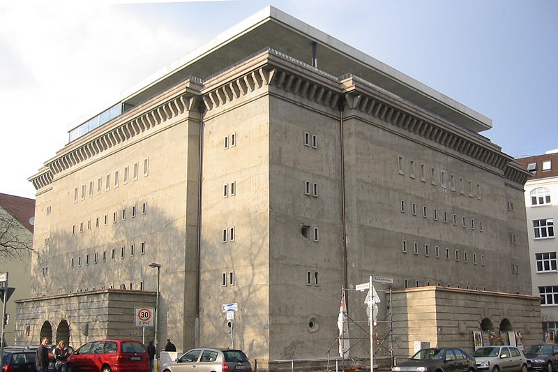
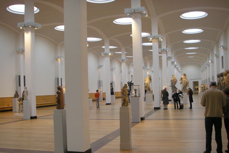
.jpg)